Apple introduced the Clean Up tool with iOS 18.1, primarily to erase unwanted objects from photos. The same feature could also be used to conceal faces – you simply draw a circle around a face and the system automatically blurs it, a function Apple markets as “Identity protection.”
With the iOS 27 update, Apple refined Clean Up so it can handle far more intricate scenes. Unfortunately, the first developer beta disables the face‑hiding capability. Instead, it produces an outcome that is both amusing and concerning.
What happens when you try to blur a face in iOS 27?
I discovered this by accident while cleaning up a picture before sharing it. I opened a photo, selected the Clean Up tool, and circled a face just as I always have. On the initial attempts the tool outright lied to me.
It reported that Identity protection had been applied, yet the screenshot shows the face clearly visible. I decided to push further. Rather than circling the face, I painted over it with my finger. That’s when things got strange.
Instead of blurring or removing the face, the system generated an entirely new one. The AI‑crafted face was so convincing that anyone viewing the image would assume it was the original subject, not a replacement.
To rule out a one‑off glitch, I repeated the test with several photos of different people. Every time, circling a face resulted in a false “blurred” message, and painting over it produced a completely new face.
Sure, this is the first developer beta, so bugs are expected, but this feels less like a typical bug and more like an AI hallucination. Apple relies on Gemini models for its Apple Foundation Models, and it appears to be inheriting some of Gemini’s notorious hallucination issues.
What should you do for now?
The upside is that we’re still in the developer beta, giving Apple a chance to fix the problem before the public beta arrives in July. If you depend on this feature for face‑blurring, stick with iOS 26 for the time being, where the blur works as intended.
If you’re already on iOS 27 and need to conceal a face today, your safest bet is the classic emoji‑cover trick. I’ve submitted feedback through Apple’s Feedback app and encourage you to do the same if you encounter the issue.
Early reports increase the likelihood that Apple will address this before release. A privacy‑focused tool shouldn’t be inventing new people, and I hope this hallucination is ironed out quickly.
A medieval icon receives a daring makeover in A24’s The Death of Robin Hood. Written and directed by Michael Sarnoski (known for A Quiet Place: Day One), the picture follows the famed archer, portrayed by Hugh Jackman, as he wrestles with a lifetime of bloodshed and remorse. After his most recent quest leaves him seriously injured, Robin Hood is offered an unexpected path to redemption under the watch of the enigmatic Sister Brigid (Jodie Comer).
Although Robin Hood has been retold countless times on screen, Sarnoski’s version diverges sharply from earlier adaptations. By reshaping familiar figures and thrusting them into a harsh, intense storyline, he injects fresh vitality into a centuries‑old myth, rendering it more grounded, tragic, and gripping than ever before.
In a conversation with Techgeeks, Sarnoski detailed his approach to portraying Robin Hood as a deeply flawed individual, his collaboration with Jackman and Comer, and his use of visceral violence to explore themes of guilt, forgiveness, and redemption.
How the film redefines iconic characters and narratives
Sarnoski said his fascination with Robin Hood’s downfall grew from childhood exposure to the legend. He didn’t think another Robin Hood movie was necessary, yet the story he’d drafted before A Quiet Place: Day One captivated him so strongly that he felt compelled to bring it to the screen.
“I’ve always been drawn to the ‘death of Robin Hood’ ballad,” Sarnoski told Techgeeks. “It struck me as both beautiful and profoundly human, and I’ve wanted to explore it for years.”
Instead of depicting Robin as a youthful rebel championing the oppressed, the film presents him as an aging, regret‑laden outlaw haunted by his brutal past. Early scenes reveal that the popular tales of stealing from the rich and giving to the poor are myths; the real Robin is a ruthless thrill‑seeker who kills without hesitation, leaving generations of avengers in his wake.
By the time the story opens, Robin Hood is a fierce yet remorseful old man counting down the days until he can settle his countless “blood debts.” Jackman balances ferocity with vulnerability, making the character compelling even at his darkest. When a chance at a new beginning appears, Jackman delivers a moving performance that elevates the film’s meditation on forgiveness.
“[Jackman] invested immense thought into this role,” Sarnoski explained. “When he first read the script, he was clearly moved by the moral grayness and eager to dig into it. Working with him has been a privilege; we couldn’t have made this movie without him.”
Jodie Comer anchors the film’s emotional core
Sister Brigid flips another staple of Robin Hood lore on its head. Rather than the treacherous prioress who lets Robin bleed out, Brigid is re‑imagined as a compassionate healer devoted to safeguarding children and mending the wounded at her priory.
Sarnoski revealed that he crafted Brigid specifically for Comer, praising her ability to layer performances with wisdom, innocence, and humanity.
“She brings a quiet, gentle strength that holds many contradictions within her,” Sarnoski said. “The prioress needed someone like that to contrast and mirror Hugh’s intensely portrayed Robin, and I can’t imagine a better pairing.”
While Robin and Brigid are opposite to their traditional versions, their relationship drives the narrative. The revelation that Robin killed Brigid’s husband adds a fresh, emotionally charged dynamic built on grief, culpability, and the possibility of forgiveness.
The film exposes medieval brutality
Popular media often romanticizes the Middle Ages with glittering castles and chivalrous knights. The Death of Robin Hood shatters that illusion by showing the grim reality of everyday life in that era.
The opening sequence follows a peasant girl trekking through wind‑blasted mountains, immediately establishing a bleak, unforgiving tone. Even a simple exchange between her and Robin spirals into a life‑or‑death struggle, underscoring how desperate people were to survive.
Although the movie is graphically violent, the bloodshed is never glorified. Sarnoski insisted the violence should feel more akin to horror or war than to a glossy Hollywood action blockbuster.
There are no grandiose battles of armored knights on horseback. Instead, ordinary folk clash brutally, tearing flesh and leaving wounds that linger long after the fight.
Sarnoski makes the audience feel each slash, burn, and arrow, forcing viewers to sit with the pain well after the conflict ends. This unflinching portrayal captures the horrific nature of Robin’s criminal existence, stripping away the romantic sheen of his legend.
“It needed to be uncomfortable because that’s what the characters are wrestling with,” Sarnoski explained. “We wanted to convey that Robin wasn’t a hero and that he lived a brutally violent life, not a swashbuckling adventure.”
Don’t expect a nonstop action spectacle like John Wick or Sisu. The film is a measured, thought‑provoking character study that reimagines Robin Hood’s saga with both cruelty and beauty.
What viewers should take away
As the title suggests, the story does not conclude with a fairy‑tale happy ending. Sarnoski isn’t simply offering another dark retelling; he’s crafted a realistic, emotional drama that showcases humanity at its best and worst.
Jackman’s Robin Hood is far from the familiar hero, and that very departure makes the film compelling. By turning a celebrated outlaw into a flawed man seeking peace, Sarnoski delivers one of the most distinctive and resonant adaptations of the legend.
“I hope audiences arrive with an open mind, ready to see a version of Robin they never imagined, and leave reflecting on the stories we tell ourselves and each other,” Sarnoski said.
The Death of Robin Hood opens in U.S. theatres on June 19.
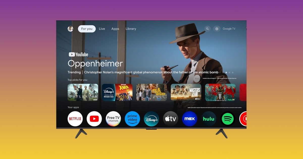
Adjusting your Google TV settings is one of those tasks that sounds straightforward until you’re three menus deep looking for the brightness slider. Google has now streamlined that experience. The company has introduced new Gemini controls, and TCL is the exclusive launch partner, so TCL TV owners can use the feature for the first 60 days before it becomes available on other Google TV brands.
What do the new Gemini TV controls actually offer?
Instead of hunting through settings menus, you can simply speak to your TV. Ask Gemini to modify brightness, contrast, volume, or picture modes with your voice. If something looks or sounds off, describe the issue in plain language. Phrases like “the screen is too dark” or “I can’t hear the dialogue” will trigger Gemini to adjust the settings automatically. You can also request Gemini to fine‑tune settings based on the content you’re watching, or jump straight to the settings menu without navigating multiple screens. It’s a seemingly minor feature that saves time every time you use it.
Which TCL TVs receive the update?
The rollout is live now for select 2025 and 2026 TCL Google TV models in the US. Compatible models include the QM9K, QM7L, RM7L, X11L, QM9L, QM8L, and RM9L. It remains unclear whether older TCL models such as the QM6K, QM7K, or QM8K will get the update later.
The timing is noteworthy as well. With the FIFA World Cup kicking off this summer, having quick voice control over picture and sound settings before a big match is a handy addition. Google is also launching a dedicated World Cup Hub on Google TV, offering live match info, schedules, highlights, and YouTube content.
Take a moment to think about how many things in your home are now automated. Your robotic vacuum cleans the floors. The temperature on your thermostat changes before you even arrive home. The camera by your front door recognizes people arriving.
Now go outside. You will find that your lawn is still waiting for you to take out a gas-powered mower and mow it every Saturday. Indoor smart home technology is relatively mature, but the moment you step outside, things get more complicated. This gap has been a persistent challenge for the smart home industry.
Why the yard got left behind
There are good reasons outdoor automation took longer. Indoors, the problems are bounded: walls, flat floors, and predictable furniture. A robot vacuum maps the living room and gets to work. Outside, it’s not so simple. Terrain changes. Grass grows unevenly. There are trees, slopes, flower beds, patio chairs that get moved every weekend, garden hoses left out, kids’ toys scattered across the lawn. That’s all before considering the weather. And unlike a floor, a yard doesn’t always have walls or fences to define its edges.
That last point is responsible for the biggest source of friction with early robotic lawn mowers. Most required homeowners to install a boundary wire around the perimeter of their yard. It involved burying or staking a physical wire into the ground to tell the mower where to stop. This worked, technically. But it was tedious to set up and easy to damage, making it a real barrier to the kind of effortless experience people have come to expect from indoor smart home devices.
The alternative to a boundary wire was to install an RTK base station, which involved mounting an antenna and relying on GPS to guide the mower. This resolved the issues with wire installation, but could result in poor performance under dense foliage or next to fences and buildings.
The tech that’s changing the math
Aware of these hurdles, manufacturers have brought a new crop of robot mowers to market. The Sunseeker S4 is one of them. Among its peers, it has a notable feature: there is no boundary wire to bury and no RTK base-station antenna to mount on a roofline or pole. The experience of setting up the S4 more closely resembles setting up a new robot vacuum, without the trench-digging or antenna-mounting steps required by some earlier systems. The S4 achieves this by using its onboard sensors to understand the yard directly. Its AllSense™ Vision AI and 3D LiDAR work together to build a live picture of the mower’s surroundings, helping it identify common backyard obstacles and navigate messy, lived-in yards.
However, these capabilities come with some constraints. Importantly, the S4 is not compatible with St. Augustine or Zoysia lawns. The remaining limitations are relatively narrow. The Sunseeker S4 can maintain yards up to 0.25 acres, can handle slopes up to 42% (22°), and can process up to 100 different zones across 5 maps, meaning a single unit can tackle split front and back yards. Many suburban lawns fall within these criteria. Full compatibility, pricing, and availability information is available through Sunseeker’s official channels.
What using it looks like
Setup happens via the app. You create your mowing zones and set a schedule. Compared to previous generations, setup is notably shorter and simpler. No digging trenches. No staking boundary wires. No roofline RTK antenna setup.
Once it’s running, the S4 uses its LiDAR and Vision AI to detect and attempt to navigate safely around common yard objects such as toys, pets, outdoor furniture, and garden features. It mows on a regular schedule, which is better for the grass: frequent light cuts are healthier than the scalp-and-recover cycle that many homeowners default to when the mower finally comes out on Sunday afternoon.
The whole experience reflects how the category is evolving. The user sets it up, checks in through the app when they want to, and otherwise stops thinking about mowing.
The robot vacuum parallel
The comparison is hard to avoid. Ten years ago, robotic vacuum cleaners were an innovation. At first, most of them weren’t very practical. Early models randomly bounced off every object in the home, doing more to entertain than to save your labor. But over time, they got better. Setup became easier. Object detection improved drastically. Precise mapping became feasible. Eventually, robot vacuums transitioned from novelties to realistic replacements for your vacuum cleaner.
Robotic lawn mowers appear to be moving towards a similar threshold. The category of AI lawn mowers has progressed from cumbersome, installation-heavy gadgets to practical outdoor smart home appliances. The Sunseeker S4 is one example of this shift. A 3D LiDAR robotic mower that does not require setting boundaries using a perimeter wire and can navigate a “real” yard is a completely different type of product than those available within the category five years ago.
Are robot mowers ready for prime time?
The change in approach among robot mower manufacturers is good news for smart home users who are eager to automate their lawn care. The initial setup overhead and friction are steadily being reduced compared to previous generations.
For prospective users with compatible yards under 0.25 acres, the options for robot mowers that don’t require wire or RTK station installation are growing. If you’ve been considering a robot mower but have been hesitant due to the challenges, the barrier to entry is now lower than before.
However, the limitations may still be too narrow for some users. A mower like the S4 is not going to replace a riding lawn mower for large lawns of premium grass like St. Augustine, nor will it fare well with steep or otherwise extreme terrain. It may still be some time before the market sees equipment capable of addressing these challenges.
More information about the S4 and Sunseeker’s full lineup of robot mowers is available on Sunseeker’s official website and its Facebook, Instagram, and YouTube channels.
Disclaimer: Pricing and availability are accurate at the time of publication but may change. Prices may fluctuate during major retail events such as Prime Day. Please check the retailer’s website for the most up-to-date pricing and promotions.
For most of the past year, Microsoft has insisted that the future of AI on Windows belongs to Copilot+ machines. To access the most advanced local AI features, you supposedly needed a PC equipped with a dedicated Neural Processing Unit (NPU). That was the premise. Now, Microsoft seems to be changing the game.
According to the latest documentation, Windows 11’s local Language Model APIs are able to run on non‑Copilot+ PCs as long as they sport an Nvidia GeForce RTX 30‑series GPU (or newer) with a minimum of 6 GB of VRAM. At first glance, this appears to be a developer‑centric tweak, but in practice it could represent one of the most consequential adjustments to Microsoft’s AI‑PC strategy since the Copilot+ line debuted last year. More importantly, it forces us to revisit a lingering question from the start of the AI PC era: were NPUs really a prerequisite for these workloads?
The Copilot+ exclusivity era felt a bit odd
When Copilot+ machines launched in June 2024, Microsoft marketed them as the gateway to native AI experiences on Windows. To qualify, a device needed 16 GB of RAM, an SSD, and an NPU capable of delivering at least 40 TOPS of AI performance. The messaging implied that such specialised chips were essential for running AI locally. While that’s true for efficiency, it never painted the whole picture.
Anyone familiar with AI hardware already knew that GPUs were more than capable of handling these tasks. In fact, modern graphics cards often out‑perform NPUs when it comes to running language models and generative AI apps. That’s why enthusiasts have been relying on GPUs for years, whether they’re experimenting with small language models or image generators. Yet Windows’ built‑in AI features remained locked behind the Copilot+ badge.
This created a strange situation: a gaming rig with an RTX 4070 had more than enough horsepower to run AI models locally, but it couldn’t tap into Microsoft’s native AI framework because it lacked an NPU. Meanwhile, a thin laptop with a qualifying NPU could. The new change doesn’t erase that split entirely, but it certainly narrows it.
Microsoft may be laying the groundwork for AI beyond NPUs
The expanded Language Model APIs let developers harness local AI capabilities on supported Nvidia hardware. Microsoft states that these APIs now operate on non‑Copilot+ systems equipped with RTX 30‑series GPUs or newer, provided they have at least 6 GB of VRAM. The APIs run Microsoft’s compact on‑device language model, Phi Silica, which can be used for summarising text, rewriting content, turning prose into tables, formatting information, and generating responses to prompts.
Think of it as a lightweight, on‑device counterpart to the AI features people usually associate with services like ChatGPT. The key difference is that everything runs locally, not in the cloud. This matters for two reasons: privacy—your sensitive documents, notes, emails and drafts never leave the PC—and performance—local AI can respond instantly without waiting on remote servers, subscriptions, or an internet connection.
What’s intriguing is Microsoft’s distribution model. If an app requires Phi Silica, Windows can fetch the model via Windows Update and execute it locally on compatible hardware. In other words, the OS is starting to treat AI models as just another Windows component rather than a premium add‑on reserved for a specific class of PCs—a notable philosophical shift.
Is the Copilot+ exclusivity ending?
Don’t assume every AI feature is now coming to older Windows machines. Tools such as Recall, Click to Do, and some of Microsoft’s AI‑powered creative utilities still appear tied to systems with NPUs. The current broadened support applies only to the Language Model APIs, which focus on text‑based AI experiences.
History, however, shows that such walls rarely stay up forever. Once Microsoft proves that local AI runs smoothly on mainstream RTX hardware, it becomes harder to justify keeping certain AI experiences exclusive to NPUs. Developers won’t care whether the workload runs on an NPU or a GPU as long as it works well, and consumers certainly won’t. That’s why this update feels more impactful than the documentation change alone suggests.
For now, it’s just one API, but it also marks Microsoft’s first meaningful acknowledgment of a point many PC enthusiasts have been making all along: capable GPUs were never the bottleneck. If local AI can run flawlessly on millions of existing RTX‑powered PCs, the line between a “Copilot+ PC” and an ordinary Windows PC may soon become far less significant than Microsoft originally envisioned.
If there’s one gadget class I’ve become almost addicted to over the past few years, it’s handheld gaming PCs. I’ve logged hundreds of hours on the Steam Deck, bought an original ROG Ally for myself, and most recently did a deep dive into the ROG Xbox Ally X. I’ve watched the segment grow from a niche experiment into a viable alternative to a gaming laptop for quick couch sessions or travel. I’ve also lived through its biggest flaw: no matter how refined these devices become, a trade‑off always lurks—be it battery life, thermals, raw performance, or software quirks.
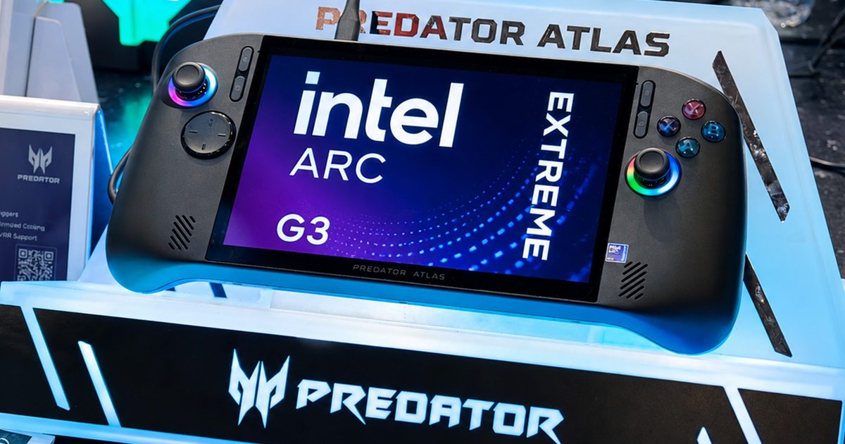
So when I arrived at Computex 2026 and got hands‑on time with Acer’s fresh Predator Atlas 8 and MSI’s newest Claw 8 EX AI+, my excitement was natural. Not only because they look striking, but because they bring something the handheld arena has been starving for: genuine competition. In truth, Intel’s new Arc G3 Extreme processor could be the most consequential handheld announcement in years, and honestly, it feels long overdue.
Intel’s Arc G3 Extreme feels like the reset button the company desperately needed
For a long time AMD has ruled Windows‑based handhelds, powering everything from the ROG Ally to the Lenovo Legion Go with its Ryzen Z‑series silicon. Intel’s earlier forays fell short due to uneven drivers and poorer efficiency, but the Arc G3 Extreme appears to be a clean break. Instead of repurposing laptop chips, this is a graphics‑first design built expressly for handheld gaming, based on Intel’s new Panther Lake architecture and fabricated on the advanced 18A process.
The centerpiece is the integrated GPU, which houses 12 next‑gen Xe3 cores and supports hardware‑accelerated ray tracing and XeSS 3, including Multi‑Frame Generation. The aim isn’t merely higher frame rates but achieving them efficiently, delivering smoother AAA titles without draining the battery at an alarming pace. Intel claims up to a 42 percent performance uplift over competing solutions in certain tests, along with notable gains in performance‑per‑watt.
Those numbers will need solid third‑party verification, but after spending several hours with the hardware they no longer seem far‑fetched. What struck me wasn’t just the FPS readout but the overall polish. Games launched quickly, animations were fluid, and I never witnessed any jarring stutters or erratic frame pacing. Everything just worked—a surprisingly refreshing experience in a segment that has often demanded a lot of patience from early adopters.
Intel also seems to have made real strides on the software front. Past Arc products were plagued by driver inconsistencies, yet my brief hands‑on suggested a much more mature approach. While a demo floor can’t replace long‑term testing, the experience felt notably refined. After years of juggling handhelds, I’ve grown accustomed to making compromises—dropping wattage to save battery, lowering graphics settings for smoother play, staying tethered to a charger when a demanding AAA title saps power. Using Intel’s new platform made me wonder if those compromises are finally starting to shrink.
The Acer Predator Atlas and MSI Claw hands‑on experience
Acer has flirted with handhelds before (think the Nitro Blaze line), but the Predator Atlas 8 feels like its first true flagship push into the space. It offers comfortable ergonomics, responsive controls, and a premium build that inspires confidence instantly. Its custom AeroBlade cooling kept temperatures in check even under heavy loads, and the vibrant 8‑inch 120 Hz screen stayed readable under the bright Computex lighting. More importantly, once I started playing, I forgot the specs entirely and simply enjoyed the session—a high compliment for any gaming device.
The MSI Claw 8 EX AI+ appears to be the result of MSI actually listening to feedback from its earlier handhelds. The revamped ergonomics make it far more comfortable to hold, the buttons and triggers feel satisfyingly tactile, and the overall feel is noticeably more refined. Paired with Intel’s Arc G3 Extreme and XeSS 3 enhancements, gameplay remained consistently smooth, while Windows’ dedicated Xbox fullscreen UI made navigation feel closer to a console than a traditional PC.
The future looks bright, but there’s one big catch
After testing both units, I didn’t leave convinced that Acer or MSI had built the superior machine. Instead, the processor powering them kept dominating my thoughts, which is perhaps the greatest compliment I can give Intel. For the first time in years, AMD finally faces a serious challenger in the premium handheld market, and the Arc G3 Extreme feels more than just another ambitious slide‑deck promise. That said, the real verdict will come once these devices land on reviewers’ desks, where battery endurance, sustained performance, thermals, and driver stability will matter far more than a polished demo.
The lingering question every gamer is asking is: what will they cost? Pricing could ultimately make or break both the Predator Atlas 8 and the Claw 8 EX AI+, but regardless of the price tag, I left Computex feeling genuinely optimistic about handheld gaming’s trajectory. The Steam Deck sparked the revolution, ASUS pushed it forward, and now Intel appears ready to shake things up in a big way. If the Arc G3 Extreme lives up to its hype, the biggest winners won’t be the companies behind it, but gamers like us.
Budget Windows notebooks have long suffered from a lackluster reputation. While their low price is a clear advantage, the devices often feel disappointing to use. If you’ve spent most of your time in the Apple ecosystem, you know the drill: flimsy plastic shells, dim displays, and mushy keyboards. The specifications may look decent for the cost, but the actual experience rarely thrills.
During my recent trip to Taiwan for Computex 2026, I was eager to see the most powerful gaming rigs and the latest tech breakthroughs. You normally expect the top‑tier offerings from the industry giants, not budget announcements. Yet this year, the most compelling laptop story wasn’t about monster gaming machines, AI workstations, or ultra‑expensive creator tools.
Instead, I discovered a new wave of budget‑premium Windows laptops that appear designed to take on Apple’s MacBook Neo in terms of price, build quality, and everyday usability. While several affordable announcements have appeared lately, Dell and Acer really stood out with their latest models. The Dell XPS 13 and Acer Swift Air 14 AI seem like laptops that the average buyer or student on a tight budget could actually consider.
Both devices seem to have taken note of what Apple got right with the MacBook Neo: people want a machine that feels premium without hitting four‑figure prices.
The new XPS 13 makes a bold statement
Dell’s decision to revive the XPS line was already welcomed, and the XPS 13 takes that enthusiasm a step further. A solid value laptop is great, but offering a premium experience at a reasonable price is almost a no‑brainer. The XPS series has always represented Dell’s high‑end consumer line, known for tight construction, clean aesthetics, excellent screens, and a polished Windows experience. Seeing a fresh XPS 13 start at $699—and even drop to $599 for eligible students—shifts the conversation.
This is especially significant given today’s painful RAM and component pricing environment. Many manufacturers are squeezed to keep costs low while memory prices climb, forcing compromises such as poorer screens, basic webcams, and cheaper chassis. Those trade‑offs have made price hikes inevitable, which makes the XPS 13’s approach feel refreshing.
The revamped XPS 13 still boasts an aluminum chassis, a 2.5K anti‑reflective touch display, back‑lit keyboard, Windows Hello, quad speakers, faster USB‑C, Wi‑Fi 7, and a starting weight of just 1 kg. Dell targets this notebook at students, young professionals, and first‑time premium‑laptop buyers who want something that feels nicer than the typical entry‑level Windows device.
It’s still about $100 more than the MacBook Neo, but the gap is justified by a smoother 120 Hz panel, a useful back‑lit keyboard, biometric login even in the base model, and double the starting storage capacity. Performance with Intel’s Wildcat chips still needs thorough testing, but the overall package positions the XPS 13 as a serious MacBook Neo contender.
Acer’s Swift Air 14 AI joins the fray
The Dell XPS 13 isn’t the only contender. Another promising sight at Computex 2026 was the Acer Swift Air 14 AI. It follows the premium direction with an all‑aluminum Windows laptop featuring Intel Core Series 3 processors, an integrated NPU for AI‑enhanced features, a 14‑inch 120 Hz display, quad speakers, an IR camera with Windows Hello, a privacy shutter, dual Thunderbolt 4 ports, USB‑A, and a 70 Wh battery.
This is a far stronger package than the traditional notion of a budget laptop. The MacBook Neo still holds clear advantages—sharper display, macOS ecosystem, and superior battery efficiency. However, Acer counters with a larger 14‑inch screen, smoother 120 Hz refresh rate, greater port variety, Windows Hello facial recognition, and a design that doesn’t apologize for its price.
MacBook Neo gave Windows a wake‑up call
A major factor behind the Neo’s success was Apple’s deep understanding of its own formula. Offering a premium product at a more accessible price reshaped the laptop market, making Windows no longer the obvious value choice. Dell and Acer aren’t trying to undercut Apple by simply lowering prices; each adds distinct touches that keep them separate from Apple’s entry‑level offering.
Neither notebook magically solves all budget‑laptop woes. The return of 8 GB base configurations is still something to watch, especially for users planning to keep a device for several years. Nonetheless, these machines demonstrate that affordability no longer has to mean boring hardware. For the first time in a while, the Windows side appears to have a genuine answer to Apple’s budget‑premium strategy.
From fitness trackers to sensory technology, a growing category of devices is exploring how personalized guidance may fit into everyday wellness routines
A decade ago, most wellness products asked people to follow the same routine. Download the app, follow the plan, and hope it works.
That approach reflected how many health and wellness products were designed at the time. Whether someone was tracking exercise, improving sleep habits, or trying a new wellness device, the experience often looked nearly identical from one user to the next.
Consumers increasingly expect something different today. Streaming services recommend what to watch. Shopping platforms suggest products based on past purchases. Even navigation apps adjust routes in real time. As people have become accustomed to personalized experiences in other parts of their lives, many wellness companies have started moving in the same direction.
Rather than offering identical experiences to every user, many companies are building products designed to respond to individual habits and preferences.
The Shift Toward Personalization
Personalization now appears across much of the wellness market. Fitness apps adjust workout suggestions based on activity levels. Sleep trackers generate reports based on nightly patterns. Other products use questionnaires, sensors, or app-based feedback to create a more customized experience.
The goal is not necessarily medical treatment. In many cases, companies are simply trying to make wellness tools feel more relevant and easier to use consistently.
Exploring Sensory Technology
Another area attracting attention involves products that incorporate sound, vibration, light, or other sensory inputs. Companies are experimenting with how these experiences may fit into daily wellness routines, often combining wearable hardware with software that adapts to individual users.
One example is SONU, a wearable device from SoundHealth. According to the company, users provide information through a companion app that helps tailor the acoustic experience delivered through the device.
The concept reflects a broader movement toward personalization rather than standardized experiences.
The Importance of Habit
One challenge facing wellness technology has little to do with innovation. It is consistency. Many people start new routines with enthusiasm only to abandon them weeks later. Because of that, companies often pay close attention to whether products become part of everyday habits.
According to company-reported information, SONU users have completed hundreds of thousands of treatment sessions. Those figures suggest that some users continue returning to the platform after trying it for the first time.
For wellness companies, that type of consistent engagement can be as important as attracting new users.
When Personalization Becomes the Expectation
Personalization has become a common theme across wellness technology, and that trend shows little sign of slowing.
Some companies are focused on fitness. Others are exploring sleep, mindfulness, comfort, or sensory experiences. Devices such as SONU illustrate how software, wearables, and user input are increasingly combined into a single experience.
The appeal of these devices may have less to do with the technology itself and more to do with the feeling that the experience was designed with the individual in mind.
This article is for informational purposes only and does not substitute for professional medical advice. If you are seeking medical advice, diagnosis or treatment, please consult a medical professional or healthcare provider.
Prices and availability are accurate as of the time of publication and are subject to change without notice. Please check the retailer’s website for the most up-to-date pricing information.
Valve is pulling physical Steam gift cards from retail stores, bringing an end to a program that has been around since 2012. The company confirmed, as spotted via SteamDB, that it will no longer send new stock of Steam gift cards to retailers once current supplies run out.
Digital Steam gift cards are not going away. Valve says users will still be able to buy them directly through Steam, and existing physical cards can still be redeemed whenever users choose. Retail stock, however, is expected to disappear by the end of 2026.
Why Valve is cutting off retail gift cards
Valve says the decision comes after years of scam-prevention efforts. The company says it worked with retailers and law enforcement, added prominent scam warnings, limited cards by currency, restricted availability, and removed cards from sale when unusual activity appeared. Unfortunately, scammers still adapted.
The issue is not limited to Steam. Scammers prefer gift cards because they are fast, widely available, and difficult to reverse once redeemed. A victim can buy one at a normal retail store, read out the code and PIN over the phone, and lose the money without ever handing over the physical card. Unlike a card payment or bank transfer, there is usually no simple chargeback process once the value has been claimed. Since no bank details are involved, it becomes much harder for victims or authorities to follow the money.
Who scammers target, and how the scam works
Gift card scams often target the elderly, isolated people, users who are less familiar with digital payments, and anyone who can be frightened into acting quickly. The setup usually starts with a phone call, email, text, or social media message.
Scammers may pretend to be government officials, tech support workers, debt collectors, utility companies, romantic partners, employers, or relatives in trouble. Although the story changes, the pressure tactic is usually the same. They insist on immediate payment, tell victims to keep the situation secret, and discourage them from ending the call.
Victims are often told exactly which card to buy and where to buy it. Once they share the number and PIN from the back of the card, the money can be drained remotely.
Valve is currently the only major company taking this step with physical gift cards. But if gift card scams keep growing, other companies may also decide that selling them in stores is no longer worth the risk.
Instagram has been subtly curating your feed for years without ever asking for your preferences. That’s about to change.
Adam Mosseri, the head of Instagram, revealed that the “Your Algorithm” feature – which allows you to view and adjust the topics the platform believes you’re interested in – will soon be rolled out to your main feed. The tool is already active on Reels and the Explore page, and this week’s update extends it to the area where most users spend the most time.
What is “Your Algorithm” and how does it function?
“Your Algorithm” displays the topics the system thinks matter most to you and gives you the ability to manage them. You can browse the complete list, add topics you’d like to see more of, and remove those you’re not interested in.
At present, the feature is limited to topics, but Instagram says it’s working on expanding it to include specific people, different moods or vibes, and various content types.
Mosseri explains that the feature is made possible by a genuine shift in AI model behavior. Previously, ranking systems relied on data that no human could actually read or interpret. Now, large language models can analyze clusters of content and translate them into plain language, enabling tools like this.
Why this matters
Mosseri was unusually open in his announcement. He admitted that while algorithmic recommendations are truly helpful, they have quietly taken something away from users over time.
Your feed learned from what you tapped and watched, but you never really got to tell it what you wanted. Eventually, the interaction became a one‑sided conversation.
He says Instagram intends to base much of its next developments on giving people genuine control over their experience. He also hinted at a more ambitious future where AI could generate fully personalized app experiences on the fly, though he cautioned that such a version would be considerably more complex.