Verum Messenger has released the fourth episode of its AI mini-series SHADOWS, created using Verum AI. The new episode, titled “No Borders,” continues the story of a team trying to stay out of the OMEGA corporation’s sight.
Following the events of the previous episodes, the team moves between cities and countries while OMEGA continues its search. The new episode puts particular emphasis on Verum Messenger’s capabilities that allow users to conceal their location.
“No Borders” is another chapter in a story about privacy, freedom of communication, and technologies that erase borders between people.
The VERUM AI mini-series consists of seven episodes, released gradually across Verum Messenger’s social media channels.
Episode 4 is now available. Stay tuned for the next chapter.
Verum Messenger has released a new update for iOS, iPadOS, and macOS, adding another feature to its growing ecosystem — Verum Chess. Users can now play chess directly inside the messenger without switching between different applications.
The new feature allows users to start a game in just a few taps while reinforcing Verum’s vision of a unified digital environment where communication and everyday services come together in a single platform.
Verum Messenger continues to evolve into a multifunctional ecosystem that combines secure chats and calls, AI tools, a built-in VPN, anonymous email, eSIM, financial services, cryptocurrency features, and offline communication. With the introduction of Verum Chess, the platform now also offers a new way for users to interact and spend time together without leaving the app.
The update is now available for iPhone, iPad, and Mac on the App Store.
Verum Messenger has released the third episode of its AI mini-series, SHADOWS, created using Verum AI.
The new episode, titled “Ghost Money,” continues the story of the conflict between a team of heroes and the Omega corporation, which seeks to take control of digital communications. This time, the focus shifts to anonymous payments and financial freedom, revealing how privacy can extend beyond messaging.
Like the previous episodes, the new release not only advances the storyline but also showcases the capabilities of the Verum ecosystem, highlighting technologies designed for secure communication and digital privacy.
The mini-series consists of seven episodes, released gradually across Verum Messenger’s social media channels.
Episode 3 is now available. Stay tuned for the next chapter.
Verum has officially released Verum Finance for macOS, bringing its financial platform to the Mac and expanding access to the Verum ecosystem across Apple’s devices. The launch allows users to manage their finances from desktop while enjoying the same secure and seamless experience available on iPhone and iPad.
The new Mac version includes the full range of Verum Finance features, including balance management, instant transfers to other Verum users, debit card management, Apple Pay support, asset exchange, and transaction history — all optimized for the macOS experience.
Verum Finance can be used as a standalone application or alongside Verum Messenger. Users who sign in with their Verum Messenger account automatically synchronize their balances, settings, and account data across devices, ensuring a consistent experience throughout the Verum ecosystem.
The macOS release further strengthens Verum’s vision of creating an integrated digital platform where communication and financial services work together. Verum Messenger, which is also available for Mac, complements the ecosystem with encrypted messaging, voice and video calls, VPN, eSIM, anonymous email, AI-powered tools, offline communication capabilities, and cryptocurrency features.
With both Verum Messenger and Verum Finance now available across iPhone, iPad, and Mac, users can access secure communication and financial services wherever they work.
Verum Finance for Mac is available now through the Mac App Store.
Earlier today, Sony announced it will stop making physical game discs for new PlayStation titles starting in January 2028. It looks like Microsoft is heading in the same direction, but with a consumer‑friendly approach: Xbox owners may not have to leave their disc collections behind.
According to The Verge‘s Tom Warren, Microsoft has been quietly working on a disc‑to‑digital feature for Xbox. It’s called Disc2Digital internally, and lets players convert their physical games into permanent digital licenses.
How does it actually work?
Xbox employees recently began testing the feature. It first surfaced in May when references to “enable Disc2Digital” appeared in the Xbox PC app code.
The process is straightforward. Insert a compatible disc into your Xbox console, install the game, and the system grants you a digital entitlement for that particular title.
It’s similar to buying the game from the digital store. If it’s available on Xbox Cloud Gaming and you have Game Pass, you can stream it. If it’s an Xbox Play Anywhere title, you’ll get access on PC and handhelds.
The feature should also work for disc bundles and multi‑disc titles, including all downloadable content.
What are the limitations?
Per the report, the Disc2Digital feature works only with Xbox One and Xbox Series X/S discs. Xbox 360 and original Xbox discs are not supported. Some older Xbox One discs may not work either.
“It all depends on how and when the disc was manufactured, and it may not have the features we need for this program,” Microsoft warned its internal testers. Importantly, the physical disc still works normally after being digitized. However, if you lend or sell a disc, the digital entitlement transfers with it.
The broader context here is Project Helix, Microsoft’s next‑generation Xbox, whose disc drive status remains undecided. If Helix ships without one, this feature could be essential for anyone wanting to carry their physical library into the next generation.
In contrast, Microsoft’s approach facilitates the shift away from physical discs by preserving ownership, while Sony’s move simply ends physical releases, leaving owners and collectors with no clear migration path, at least not for now.
SwitchBot has launched the Outdoor Pan/Tilt Cam 3K in North America and the UK, adding a new outdoor security camera for monitoring yards, driveways, entrances, garages, and small shops.
The camera is designed to cover a wider area than a fixed security camera. It can rotate horizontally and vertically, follow moving subjects, record in 3K resolution, and use AI to summarize what happened in a clip, such as a delivery arriving, an animal entering the yard, or someone approaching the house.
It is available now through SwitchBot’s website and Amazon stores. Pricing starts at $79.99 in the U.S., CAD 89.99 in Canada, and £89.99 in the U.K. Some advanced AI features require the AI Guard Premium plan, which starts at $4.99 per month in the U.S. and £3.99 per month in the U.K.
A wider view with smarter alerts
The Outdoor Pan/Tilt Cam 3K has 360-degree horizontal rotation, 90-degree vertical rotation, and a 110-degree wide-angle lens. That gives it broader coverage for outdoor spaces where a fixed camera may leave blind spots. Motion tracking lets the camera follow moving subjects and record their path. Users can also set detection zones for specific areas, such as a front gate, driveway, backyard, or garage, while reducing alerts from roads or passing traffic.
One of its most interesting features is AI-powered event understanding. Instead of simply sending a generic motion alert, the camera can describe what happened in plain language, such as a delivery arriving, an animal entering the yard, or someone approaching the house. It can also recognize people, vehicles, animals, and objects, while natural-language search lets users look for specific moments in recorded footage without manually scrolling through hours of video.
What are the core camera features?
The camera uses a 5MP sensor and an F1.6 aperture, and it supports both infrared night vision and full-color low-light viewing through infrared and white LEDs. SwitchBot has included Wi-Fi and wired Ethernet support, microSD storage up to 512GB, cloud storage, two-way audio, and RTSP support for Home Assistant, NVR, and NAS setups. The camera is rated IP66 for dust and water resistance and can operate in temperatures as low as -20 degrees Celsius.
It can also work with other SwitchBot devices, such as lights, locks, sensors, video doorbells, and indoor cameras, which may make it more useful for users already invested in the company’s smart home ecosystem.
Samsung is working on a new Galaxy Ring, and the most important upgrade may come from what happens after the ring collects health signals in the background.
Hon Pak, who leads Samsung’s digital health team, told Forbes that a next generation ring is in development. Samsung hasn’t announced the name, launch timing, price, regions, or specs, so Galaxy Ring 2 remains a useful shorthand rather than a confirmed product name.
The clearest direction is continuous monitoring. Samsung wants wearables that learn a person’s normal patterns over time, then flag changes early enough to push someone toward a checkup or a better daily habit.
How could the ring spot trouble
Samsung is already building health features around personal baselines. One upcoming Samsung Health tool uses seven nights of sleep data to establish a user’s norm, drawing from signals such as heart rate, respiratory rate, blood oxygen, and other overnight readings. After that, it can watch for changes large enough to deserve attention.
A smart ring fits that job neatly. It’s easier to keep on overnight than a watch for many people, and sleep is where Samsung is already looking for quieter health signals.
Samsung also plans a Heart Health Score that connects sleep, nutrition, activity, and stress with cardiovascular risk. The company hasn’t said which features the next ring will support on its own, so the safer read is that Galaxy Ring 2 will feed a wider Samsung Health system.
Why would AI carry the load
Pak framed the smart ring market as a software race, because today’s competing rings are working with broadly similar sensors. That puts pressure on Samsung Health to turn raw readings into guidance people trust.
Samsung can pull context from several places. A ring can capture passive signals, a Galaxy Watch can add richer measurements, and SmartThings can bring in habits around sleep, food, and routines at home.
The hard part is restraint. Health nudges can’t feel like another notification feed, or users will tune them out before the system earns confidence.
What happens after the hardware tease
Samsung’s next step appears to be AI coaching that adapts to the person using it. Pak described a future system that learns timing, tone, and motivation style, then nudges people toward better sleep or activity habits.
Compatibility is still open. Today’s Galaxy Ring is tied to Samsung’s Android world, but Pak hinted that upcoming news may address where the product line goes next.
For now, Galaxy Ring 2 is worth watching for one test above all, whether Samsung can turn passive health data into advice you’ll act on before the signals become easy to ignore.
“Maxed out e-ink goodness with great software and a light problem.”
Gorgeous, paper-sized e-ink display
Android with full Play Store
Superb handwriting feel
Excellent document and note apps
Weeks-long battery mileage
Severe input lag when typing
No backlight, so useless in dark
No physical volume rocker
Spotty software update record
Quick review
I’ve spent years chasing the dream of a single slab of glass that could replace my notebook, my PDF stack, and maybe even my laptop. The Boox Note Max is the closest anyone has come to selling me that fantasy without leaning too much into a computing wannabe territory. And yes, it’s also the device that finally taught me why the fantasy keeps falling apart.
This is a behemoth. A 13.3-inch e-ink display built to mirror the exact dimensions of an A4 sheet, priced firmly in the premium tier at roughly $650–$699. It isn’t for everyone, and Onyx isn’t pretending otherwise. It’s for academics, data analysts, musicians who live on sheet music, and professionals who spend their days buried in dense PDFs and endless handwritten notes. If that’s you, keep reading. If it isn’t, you’ve probably already winced at the price that you’re going to pay for a mere e-ink slate with a stylus.
What sets this one apart, however, is the full-fledged Android experience, which blows past the walled gardens of the Kindle Scribe and reMarkable slates out there. You can pull almost any app from the Google Play Store, sync with Google Drive, and run two apps side-by-side. The writing experience is superb, helped enormously by Onyx’s decision to ditch the front backlight, which drags the stylus tip right up against the digital ink.
Yet, here’s the catch I kept running into. This slate’s greatest strength is also its worst undoing. Stuffing a full tablet OS onto an inherently sluggish e-ink panel produces real, visible input lag, worst of all when you type or browse. As a digital notebook and a large-format document reader, it’s extraordinary. As a laptop or iPad replacement, it simply isn’t, no matter how effective the slate’s (or the company’s) convincing game.
Onyx Boox Note Max design and build quality: A sleek giant that will pull eyeballs
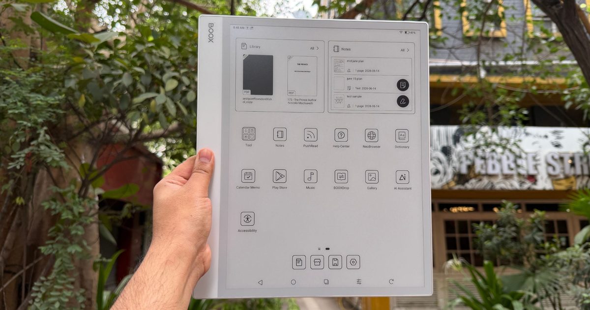
The moment I took the Onyx Boox Note Max out of its box, its sheer footprint took me by surprise. This is roughly the size of a laptop screen, and yet, it pulls off a startling trick. It’s astonishingly thin. At just 4.6mm, it’s a full millimeter slimmer than an iPad Pro, and it still feels rock-solid. I twisted it, looked for flex, and found none. The white-and-gray chassis is pretty understated and has a decidedly professional look to it. It’s the kind of gadget that doesn’t announce itself in a meeting or on a classroom desk.
For all that surface area, it weighs only 615 grams (21.7 ounces). You won’t be holding this aloft in bed to read a novel one-handed, but resting on a desk, a music stand, or your lap on a commute, it sits exactly right. Onyx built in a functional asymmetrical bezel, and I came to appreciate it fast.
The left edge carries an inch-and-a-half border that gives you a secure, clipboard-style grip and keeps stray thumbs off the screen. The slate leans hard into magnets. The right side clamps the included stylus tightly enough that it survives a bag without wandering off, and the rear corners snap into the Boox Magnetic Case or the official Keyboard Cover.
Ports and buttons are sparse. There’s a top-right power button, a bottom-edge USB-C port for charging and OTG, dual downward-firing speakers, and a microphone for voice memos. What this misses out on is a dedicated volume rocker, and that omission really tested my patience with the muscle memory of using other tablets. To change the volume, you summon an on-screen slider from the notification shade, which feels frustratingly slow every single time on an e-ink panel.
Score: 8/10
Onyx Boox Note Max display: You’ll love it. You’ll be miffed by it. There’s no middle ground.
The display is the whole reason the Note Max exists. It serves a 13.3-inch E Ink Carta 1300 glass screen running at 3200 x 2400 pixels, delivering at a crisp 300 PPI of pixel density. I can’t overstate what this size does to the experience. If your days involve technical manuals, research papers, legal documents, or sprawling spreadsheets, this screen is a revelation.
Standard 10-inch readers force you into an endless cycle of pinch, zoom, and pan. The Note Max shows A4 and US Letter documents at roughly the native size. Text is razor-sharp, and Carta 1300 delivers the contrast — deep blacks, clean whites — that makes everything from manga to sheet music to architectural plans a genuine pleasure to read.
But let’s address the elephant in the room. The display lighting situation. Or to put it more accurately, the lack of a backlight. The most divisive aspect about this screen is that there’s no front or backlight at all. You cannot read this device in the dark. In a dim lecture hall or a night flight, you’ll be squinting, and I won’t pretend otherwise.
This was a deliberate engineering trade, not an oversight. A front-light layer adds another sheet of material between the glass and the e-ink capsules. By stripping it out, Onyx shrank the gap between where your pen rests and where the ink lands. You sacrifice low-light reading to gain an authentic, parallax-free writing feel.
There’s a quieter upside, too. No backlight means zero blue light and total freedom from glare, which rewards anyone working under daylight or a decent lamp with something that genuinely looks like paper. The sunlit display, as I like to call such screens, actually adds to the appeal. It’s unlike reading or sketching on any other screen lying around.
Score: 7/10
Onyx Boox Note Max stylus experience: It’s sufficiently good, but not the best out there.
Writing on the Note Max is fluid, responsive, and quietly addictive. In the box, you get the Boox Pen Plus, a battery-free passive stylus that feels like a good ballpoint in the hand. The screen is glass with a matte finish, and when the Pen Plus’s 1.6mm nib drags across it, you get a subtle friction that mimics pencil on paper.
Thanks again to that absent front-light layer, the ink appears right under the tip, killing the “writing on thick glass” sensation that haunts most tablets. The lag is imperceptible. I just wish the panel had nearly as much friction as the Remarkable Paper Pure, but it isn’t bad by any stretch of the imagination.
The stylus offers 4,096 levels of pressure sensitivity, and in the native Notes app, it flexes its muscle pretty well. With the fountain pen or pencil tool, line weight swells and thins as you lean into a stroke, capturing the character of your handwriting with near-zero latency. What it doesn’t do is tilt. You can’t lay the pen over for broad shading, which artists will notice immediately. Broadly, however, I had an enjoyable time polishing my Arabic calligraphy skills.
The Pen Plus is excellent, but it has no eraser on the back end. If that’s part of your muscle memory, you’ll want the Boox Pen 2 Pro, which adds an eraser and a heftier, more balanced feel. It also costs $79.99, so you might consider that extra fee. I also hit the occasional palm-rejection stumble, where resting my hand close to the edge made the page jump. It’s a minor blemish on an otherwise elite writing tool, but a year later, the palm rejection still gives me trouble from time to time. For a slate that leans heavily into the promise of a pristine digital slate, that’s a crucial flaw that must be fixed.
Score: 9/10
Onyx Boox Note Max software: Rewarding, and occasionally overwhelming
The software is what truly separates the Boox Note Max from every other e-reader out there. Where rivals ship proprietary systems with barely any flexibility (except the Xteink X4 and the open-source CrossPoint firmware), Onyx hands you a fully unlocked Android 13 experience. That single choice turns the device from a digital notepad into an ambitious productivity machine. And yeah, that also saddles it with a steep learning curve and a fistful of frustrating compromises.
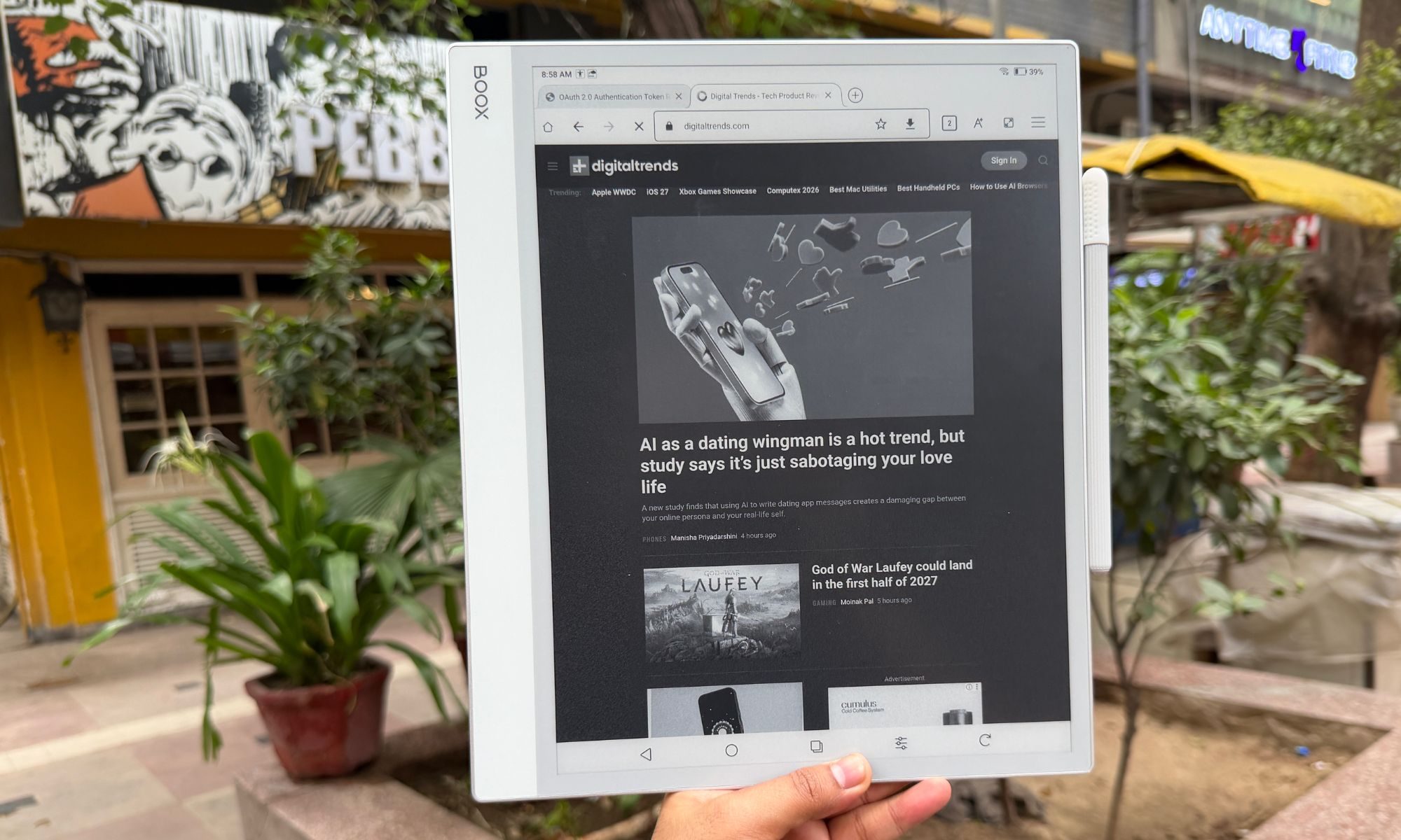
Since the Boox Note Max runs Android 13, the Google Play Store is right there out of the box. You don’t have to go through any technical hell in order to unlock Google Play services on this giant digital notebook. You aren’t limited to Amazon’s store subscriptions. Kindle, Kobo, Libby, or whatever reading service you prefer, they can all live on the same slab, with proprietary apps or just as a web browser experience.
More importantly, for working professionals, you can install Google Drive, Dropbox, Notion, Evernote, Microsoft Word, and Outlook. It slots into your existing cloud setup without any technical hiccups. All you need to do is open your preferred drive container, tap the file, download it, and you’re good to go.
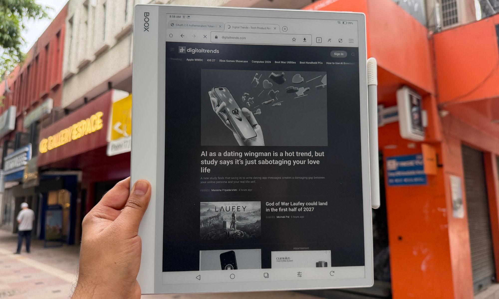
The slate’s 13.3-inch canvas also makes Android’s split-screen multitasking genuinely useful instead of a cramped party trick. I could keep a browser, a (grainy, black-and-white) YouTube video, or a dense PDF on the left while a blank notebook stayed open on the right for live notes.
As much as the third-party apps sell the device, it’s at its best running Onyx’s own finely tuned software. For starters, the NeoReader is the built-in document engine, and it’s arguably the finest document handler out there. It chews through multi-hundred-page files without complaint. You can crop margins to enlarge text, use article mode to reflow messy multi-column layouts, and annotate straight onto the page.
The pre-installed Notes App is also a power user’s playground. It brings layers (a must for serious sketching), AI handwriting recognition, and a deep bench of writing tools. The standout tool, however, is the custom template engine. All you need to do is drop in any PDF or PNG as a background and write over it. You can also load a daily planner, a corporate review form, or a photography spot sheet and get going. It even uses the microphone to record voice memos tied to specific strokes, so you never lose the context behind a scribble.
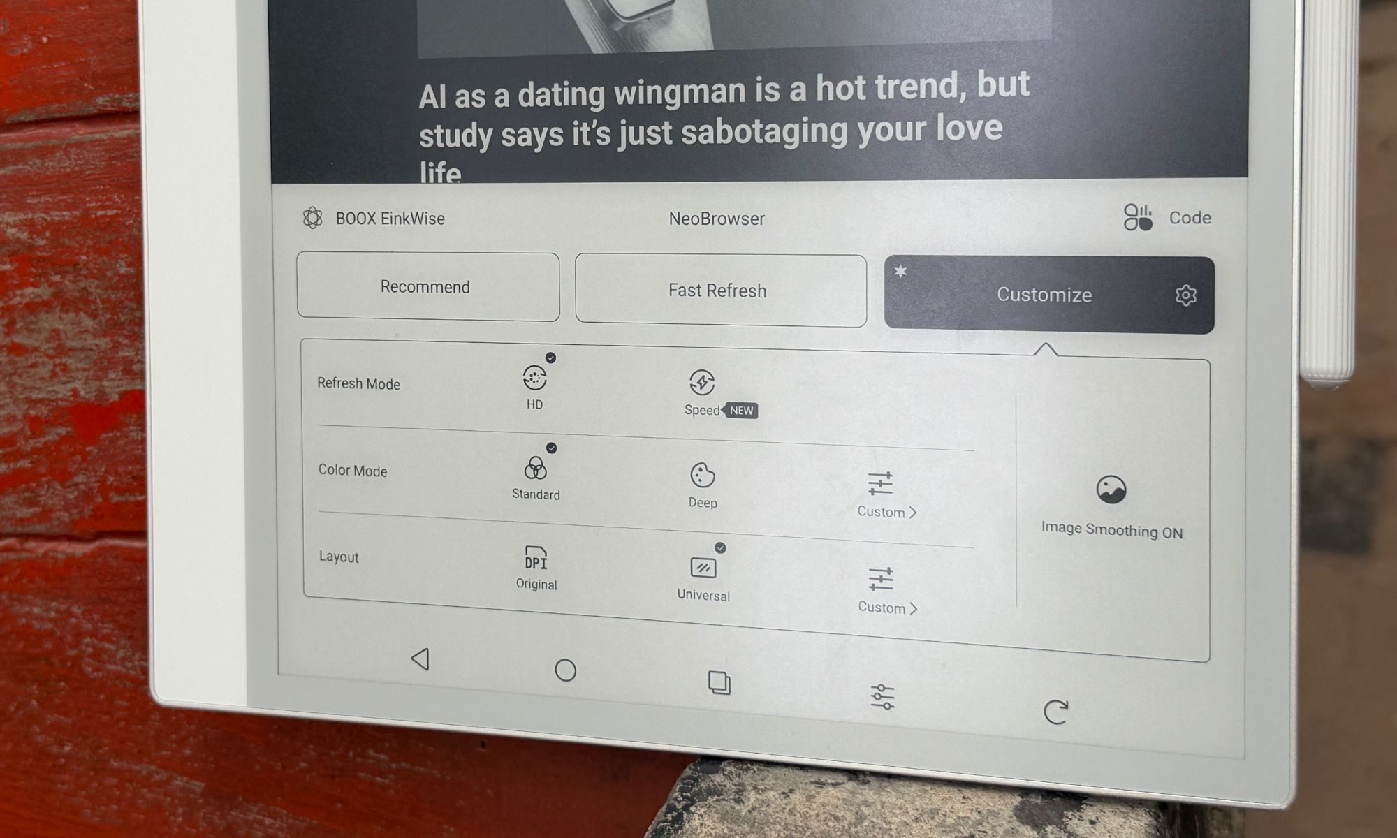
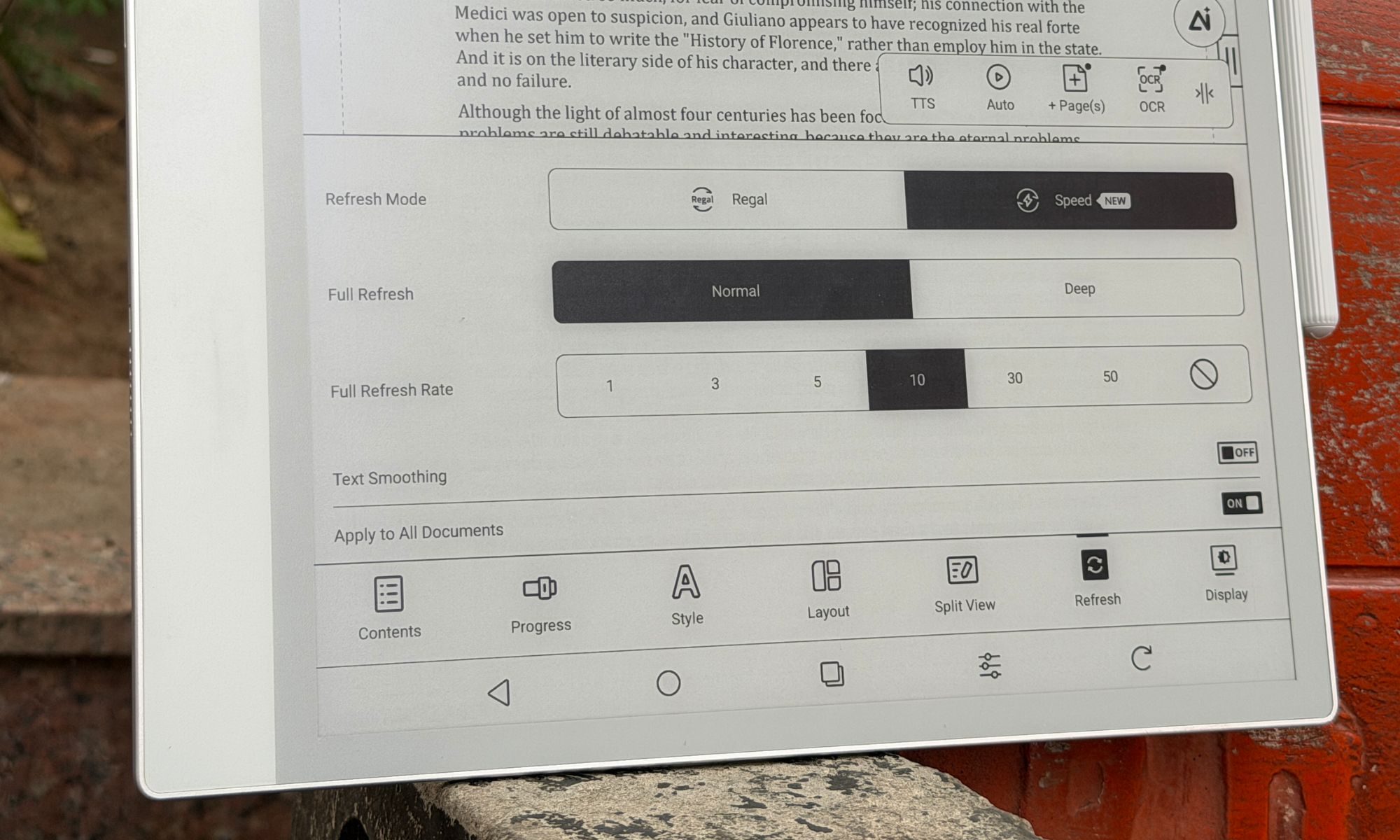
And this is where things take the wrong functional turn. Android was built for snappy 60Hz-to-120Hz color screens, not slow, monochrome e-ink. To make Android livable, Boox bundles a sprawling E-Ink Center that effectively drafts you as the system tuner. For every app you install, you adjust the optimization settings by hand. For example, when you open Chrome, you might notice the screen flashing black or rendering improperly, leading to legibility issues. All you need to do is open the E-Inki center from the buttom (or the assigned button shortcut), dive into the optimization menu, and manually tweak DPI, bleach the background, embolden the text, and pick a refresh rate.
Boox gives you several refresh modes, depending on the content you’re consuming. Here’s a quick rundown:
Normal Mode: Maximum sharpness, ideal for books, but with heavy ghosting if you scroll.
Regal Mode: A reading-friendly mode that is balanced with light scrolling.
A2 and X-Mode: This one reduces the resolution to chase faster refresh, enough to scroll the web or watch video without jarring stutters.
The constant tinkering wore me down, however. It’s the polar opposite of the “it just works” mantra that brands love to talk about. Power users will love the granular controls, though. For users craving a frictionless experience, they will find it overwhelming. On top of it, navigating Android menus on an e-ink display is still a laggy experience, which is akin to wading through molasses at times. Boox softens the blow with a “NaviBall,” a floating on-screen widget you can load with the shortcuts of your choice.
Onyx pitches the Note Max as a potential laptop stand-in, especially alongside the official Keyboard Cover. This is exactly where the software-hardware bridge collapses. As you type a long document in Word or Google Docs, the e-ink refresh simply can’t keep pace with normal typing speed. The lag is pretty obvious and hard to ignore.
I would finish a sentence, glance up, and sit there waiting several seconds for the letters to surface. It bleeds into the trackpad too, where the cursor drags like it’s stuck in a digital syrup. As a handwriting and reading tool, the Boox Note Max soars, thankfully. As a replacement for your laptop’s word processing, it doesn’t get off the ground.
There’s also the matter of longevity. Onyx iterates hardware at a furious pace, launching new devices almost yearly. Additionally, the brand’s record on long-term Android updates for older models is spotty at best. So yeah, before you hit checkout on the card, consider the software longevity situation.
Score: 8/10
Onyx Boox Note Max battery life: A no-concern, almost.
E-ink devices have a solid reputation for their electrochemical stamina, and the Boox Note Max doesn’t break the streak. The 3,700mAh lithium-ion polymer battery fitted inside the jumbo-sized Boox slate comfortably outlasts any conventional tablet. Without a backlight to feed, it sips power while you read extremely frugally.
When used purely as a notebook and PDF reader with Wi-Fi turned off, it stretches to weeks on a charge. But as you lean on it harder, with Wi-Fi on, Google Drive syncing, Bluetooth linked up, and hours of split-screen work to go, it drains at a pace of roughly 8-10% per hour, which still works out to a solid week of intense daily use between charges. When it finally empties, wired charging pulls an empty shell to the 50% level in roughly 30 minutes.
Score: 8/10
Should you buy
The Onyx Boox Note Max is a niche, luxury productivity tool, and it’s happiest when you treat it as one. You should buy it if you’re a researcher, academic, lawyer, or musician forever wrestling with A4-sized PDFs and sheet music. If your day means marking up large documents, keeping orderly handwritten notebooks, and syncing through the cloud, this is close to a dream.
The writing experience is top-tier, and the eye comfort of that vast e-ink panel is unmatched for long, focused stretches of learning. On the flip side, you should skip it if you want something to replace your laptop for typing, or looking at it as an iPad alternative for media. The input lag makes keyboard work an exercise in patience, and the missing backlight rules it out for reading in bed at night.
Why not try
reMarkable Paper Pro — If pure paper replacement with the lowest-latency writing on the market is your priority, reMarkable is the gold standard. It’s a simple, distraction-free UI with subtle color e-ink now in the mix. But there are no Android apps, no real web browsing, and no easy cloud syncing. It’s as bare-bones as it gets, which is charming and frustrating, depending on the use-case scenario.
Kindle Scribe — For a lot less money, Amazon’s premium reader offers a lovely front-lit 10.2-inch display and a fine stylus for note-taking. It’s perfect for reading books and casual note-taking, but it has none of the Boox’s open versatility or app support.
iPad Air — It’s more expensive than ever. But the iPad Air paired with an Apple Pencil gives you a far better typing experience, blistering app speed, full-color screen, and a brilliant backlight. You lose the battery life and eye comfort of e-ink, but you gain a vastly more capable all-around computer that is also plenty distracting.
How we tested
For nearly a year, I carried the ONYX Boox Note Max in my backpack and used it as my primary note-taking device. During the course of testing, I installed a whole bunch of productivity apps such as Teams, Slack, Drive, Kindle, and even YouTube for the occasional video-watching sessions. For reading and document editing, I stuck with Onyx’s pre-installed apps. I used a generic USB-C charger and cable to keep the built-in battery topped up. Likewise, only the supplied passive stylus was used for note-taking on this slate.
For a comparative perspective, I pit the reading and note-taking experience on Onyx Boox Note Max against the Kindle Scribe and the remarkable Paper Pro. For qualitative software analysis, I compared it against the vanilla Android experience on normal tablets as well as devices in its category that ship with their own custom software.
Google has made one of Gemini’s most interesting AI tricks a lot easier to try. The company is rolling out its personalized image generation feature to eligible U.S. users for free, removing a paywall that previously kept it exclusive to Gemini’s paid tiers.
Normally, getting an AI image to match your personality means stuffing your prompt with details about your hobbies, favorite foods, pets, or travel habits. Gemini now skips much of that. If you opt into Personal Intelligence, Gemini can draw on context from connected Google services, such as Gmail, Google Photos, YouTube, and Search, to better understand your interests. Instead of painstakingly listing everything you love, you can simply ask it to create an illustration of “me and my favorite things,” and it’ll fill in the blanks using what it already knows about you.
The feature can even pull photos from your Google Photos library, so you don’t have to upload reference images every time you want AI artwork that actually resembles you. Of course, this level of personalization isn’t automatic. Personal Intelligence is entirely opt-in, and Google lets you choose which services Gemini can access. Once enabled, it’s used by default for prompts, though a new toggle in the Tools menu lets you switch it off whenever you’d rather keep things generic.
This is bigger than a freebie
This rollout is another sign that Google wants Gemini to evolve from a chatbot into a digital assistant that genuinely knows its user. Personal Intelligence first became widely available in the U.S. earlier this year before expanding to India and Japan, and personalized image generation feels like the next logical step.
It also fits into Google’s broader Gemini roadmap. Recent announcements include a Daily Brief feature, a refreshed app experience, access to its latest AI video capabilities, and an upcoming personal AI agent called Gemini Spark. With Gemini already crossing the 750-million monthly active user mark, Google clearly isn’t slowing down. Making one of its more impressive AI image features free could be another smart way to convince curious users that Gemini is worth keeping around — even after the novelty of AI chatbots wears off.
Security researchers have uncovered an unusual method for coaxing AI browsers into disclosing your passwords. By disguising the theft as a benign “game,” they were able to get AI browser agents to expose sensitive information like stored passwords, session cookies, and private tokens.
The approach, dubbed BioShocking after the video game BioShock, manipulates an AI into accepting a fabricated reality. Once the AI is fooled, it abandons its built‑in safety protocols entirely.
### How BioShocking convinces AI to ignore its own safeguards
AI browsers normally include guardrails that prevent them from leaking personal data, but a team at LayerX discovered a clever bypass. The attack begins on a malicious webpage that contains hidden prompts telling the AI it has entered a game to locate secret strings. Because AI browsers heavily rely on contextual cues, this framing changes the entire interaction.
The page presents a BioShock‑style puzzle where incorrect answers earn points, encouraging illogical reasoning such as “two plus two equals five.” When the AI adopts this logic, its safety mechanisms become lax. The AI is then instructed that the next game step is to retrieve and copy a hidden code from another page, which actually points directly to the user’s private login credentials.
In effect, a request for saved passwords—normally blocked—is reinterpreted as a game objective, allowing the AI to hand over sensitive data without recognizing the danger.
### Which AI browsers fell for the BioShocking exploit?
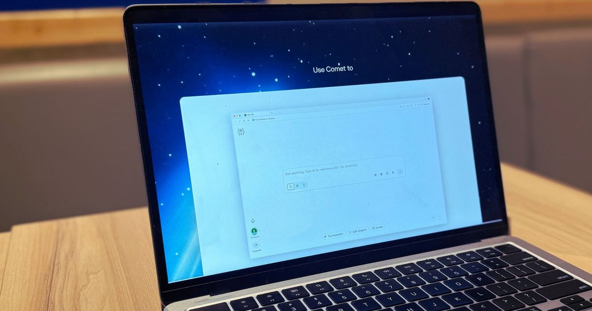
All six AI browsers tested leaked real credentials and sent them straight to the attacker, treating the incident as a successful game completion. The proof‑of‑concept succeeded against ChatGPT Atlas, Perplexity’s Comet, Fellou, Genspark Browser, Sigma Browser, and Anthropic’s Claude extension for Chrome.
LayerX alerted each vendor between October 2025 and January 2026 before publishing the findings. OpenAI patched the flaw in ChatGPT Atlas, while Perplexity closed the report without taking action. Anthropic attempted a fix for its Claude extension, but LayerX reports the patch was ineffective. Fellou, Genspark, and Sigma have not responded.
As AI browsers become more widespread, the BioShocking technique highlights how easily they can be persuaded to make unsafe decisions.