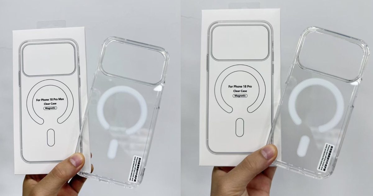
A new set of leaked protective cases for the iPhone 18, iPhone 18 Pro, and iPhone 18 Pro Max has emerged, showing almost the same picture as earlier leaks. This year’s iPhone 18 Pro and Pro Max appear to retain the same unibody aluminum chassis with a large camera island, which aligns with Apple’s habit of using a design for at least two generations.\n\nSo what’s different?\nThe case photos, obtained via MajinBuofficia, indicate that the iPhone 18 Pro lineup will be marginally thicker than its predecessor. While MacBook Pros are getting slimmer, the Pro iPhones seem to be gaining a bit of bulk.\n\nThe likely reason is the rumored 48MP variable‑aperture camera system that Apple is reportedly testing for the Pro models. Such hardware needs extra space, resulting in a thicker body. It also means last year’s cases won’t fit, nudging users toward new accessories.\n\nWe’ve heard similar speculation before; earlier leaks of the iPhone 18 Pro and Pro Max already suggested this, and the fresh case images simply reinforce those expectations.\n\nWhy is there an iPhone 18 case in the mix?\nThe leaked set also includes a case for the standard iPhone 18, which is puzzling because the base model isn’t expected to arrive until spring 2027 under Apple’s rumored staggered launch plan. Whether Apple has altered its schedule or the leak is mistaken remains unclear. No official renders or design sketches for the iPhone 18 have surfaced yet, so treat this part with caution.\n\nFor the Pro models, besides the new cameras and a slightly larger waistline, we can anticipate a brand‑new A20 Pro chip built on a 2nm process, additional color choices, improved satellite connectivity, a smaller Dynamic Island, and more.\n\nThese upgrades may not be compelling enough for a yearly upgrade, but Apple is known for surprises, so we’ll have to wait until September before drawing conclusions.
Latest News
-
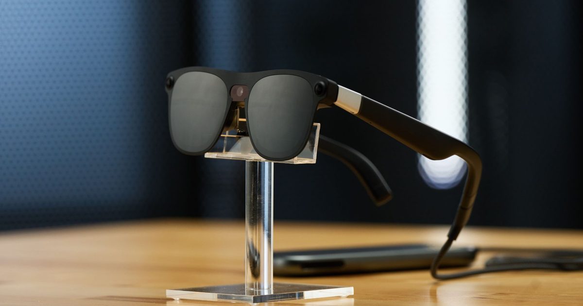
Google and Xreal’s Project Aura smart glasses will ship later this year
Google is working on a whole bunch of smart glasses. The first one running on the Android XR platform developed by Samsung is expected to arrive close to July. The slate, it seems, will get crowded pretty soon. Earlier today at the I/O 2026 Developers Conference, Google also showed off a new class of audio glasses that have been designed in partnership with Warby Parker and Gentle Monster.
But the most interesting of the bunch is the Xreal Project Aura smart glasses, which support full hand gesture support as well as mixed reality view for Android apps available through the Play Store. These smart glasses were first showcased in December 2025, but Xreal confirmed earlier today that the Project Aura smart glasses will hit the shelves in 2026.

The Project AURA smart glasses by Xreal come equipped with a built-in display that offers a 70° field of view, which the company claims is the largest FOV that has ever been offered on a pair of AR glasses. Thanks to the built-in display, you can overlay digital content in your sight while still having a clear view of the world around you. The company notes that you can run multiple app windows and get the full Android app experience without any hacks.

This is the full-blown Android experience that we are talking about. So far, the Xreal smart glasses that have been available to customers have run a custom version of Xreal’s in-house software that is launched through an app. The only way you could access Android on the Xreal smart glasses is by mirroring them through your phone or by connecting them to a PC in order to run Windows or macOS.
They have supported multi-windows, offering a massive digital canvas for you to run different apps side by side. These virtual windows can be accessed either affixed in the air, or by making them track your head movements. With the Project Aura, Xreal is getting rid of the software limitations by making these smart glasses run the native Android XR experience, with plenty of Gemini experiences in tow. So far, the demo videos released by the company have shown these glasses connecting to a smartphone-shaped puck through a cable.

Unlike the audio glasses that Google showed off earlier today, these glasses won’t be able to run the full Android XR experience without a wired connection due to the processing limitations. Talking about processing, Qualcomm will supply the chip for the Xreal Project Aura smart glasses, promising a dual-chip design which includes a Snapdragon silicon as well as a custom X1S processor.
-
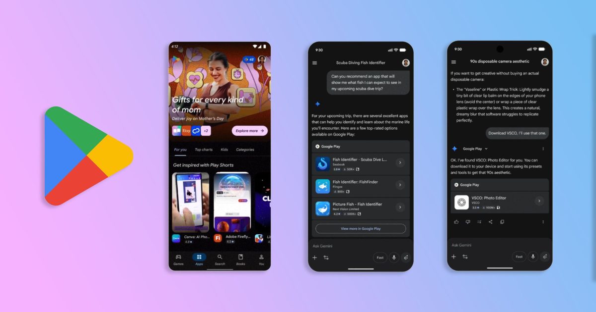
Google Play is getting TikTok-style app previews and AI-powered search
Google is expanding how users discover apps and games on Google Play, with a series of new features announced at I/O 2026 that lean heavily on AI and short-form video.
Discovery beyond the store
The biggest shift is Google Play’s integration with the Gemini app. In the coming weeks, Google will enable app discovery in the Gemini app on Android and the web, connecting apps and games to Gemini users.

Later this year, Gemini will also start surfacing over 450,000 movies and TV shows, as well as where to stream live sports, and deep-link users directly into app content. The move reflects how Google is positioning Gemini as a discovery layer for apps, games, and other content on Google Play.
New ways to browse on Play

On the search side, Google is introducing Ask Play, a conversational AI overlay for finding apps. The company says Ask Play understands the full context of a user’s question and adapts to follow-ups to recommend the right app. A companion feature called Ask Play highlights will give users a high-level summary of complex searches directly on the search results page.

Google is also updating its Play Games Sidekick overlay with new social features, including the ability for players to see which friends are playing the same game and track their achievements, with a global rollout planned for this summer.
The Play updates are part of a broader push by Google to extend the store’s reach beyond its own surface, as AI assistants increasingly become where users start their searches for new apps, games, and content.
-
Google’s Gemini Omni is an all-purpose content generator that wants to replace your entire studio
Google just walked into the video creation space, flipped the table, and handed everyone a powerful content creation tool, with no former camera or editing experience required.
Announced at Google I/O 2026, Gemini Omni is the company’s most ambitious AI model yet. It doesn’t just generate video from text, but from anything like sketches, voice notes, shaky phone footage, a picture of your dog, and turns it into a polished, coherent video.
Google’s own tagline? “Create anything from any input.” Bold, and for once, not entirely hollow.
So what actually makes Omni different from other AI video generators?
Until now, AI video generators felt mostly fragmented. Some excelled at visuals but struggled with audio, while others can’t keep characters or environments consistent between edits. That is the gap that Gemini Omni promises to bridge with continuity and conversation.
Since the tool allows you to edit or create videos with voice-based inputs sent to Gemini, it always remembers the previous instructions, which, in practice, should keep the characters and story consistent across scenes.
It’s like having a conversation with your video editor and getting videos edited with much more creative liberty. Omni can also adjust physics-aware details like lighting, motion, and environment, without the entire footage falling apart. It even understands gravity and fluid dynamics.
Who actually gets access, and what’s the catch?
Gemini Omni Flash is rolling out right now. YouTube Shorts users get it completely free, but how it actually works in practice is something that I’m yet to find out. For the Gemini app and Google Flow, you’ll need an AI Plus, Pro, or Ultra subscription, starting at $7.99 per month. Enterprise API access arrives in the coming weeks.
Every video created via Omni Flash gets SynthID watermarked invisibly. Whether that’s enough to stop misuse is a separate, much longer conversation. For now, Google has handed creators a genuinely powerful tool, and I have a feeling that the content landscape is about to get very loud.
Google has been playing catch-up in generative video for two years. Veo was capable but clunky, a text-to-video tool in a world that had moved on to full creative pipelines. Gemini Omni is the course correction: a unified model that handles the whole workflow.
-
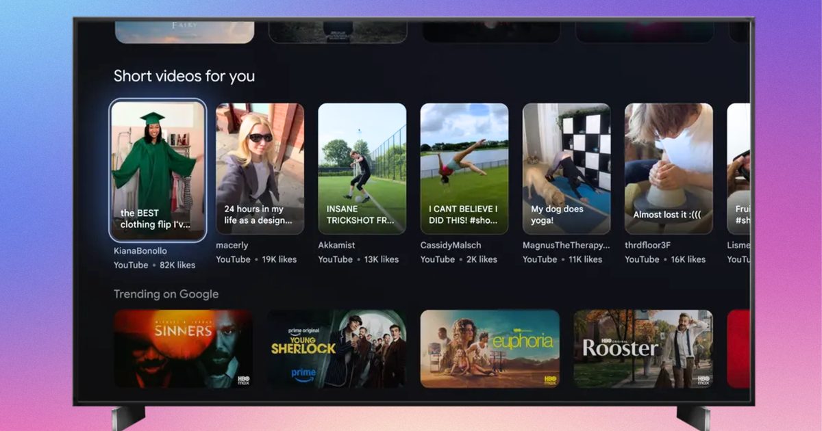
Google wants to reinvent your TV remote with Gemini and pointers controls
Google is making a bigger play for the living room, and this time, it is not just about what you watch — it is also about how you interact with your TV. At Google I/O 2026, the company revealed a fresh batch of updates for Google TV and Android TV developers, all centered around one idea: TVs are no longer passive screens sitting in the corner of your house. With more than 300 million monthly active devices across Google TV and Android TV, Google clearly sees the television as its next major AI battleground. And Gemini is now at the center of that strategy.
The company says Gemini is already helping users discover content through natural voice interactions. But Google now wants the experience to feel more dynamic and conversational, almost like searching the web — except on your couch. Instead of only surfacing static results, Gemini on Google TV can now respond with a combination of visuals, videos, and text snippets to answer queries. So if someone asks for a thriller with a strong female lead or a documentary about space exploration, Gemini pulls contextual recommendations directly from streaming apps and their metadata.
For streaming platforms, that is a massive shift. Discovery on TVs has historically been messy, fragmented, and heavily dependent on whichever app you opened first. Google seems to be positioning Gemini as the layer that sits above all of that, acting as an intelligent content guide rather than a basic search tool.
Your TV remote is evolving
Interestingly, Google’s bigger announcement may not actually be Gemini itself. It is the remote control. The company says future Google TV devices will increasingly support “pointer remotes,” which bring motion and cursor-based navigation to televisions. Think of it as a halfway point between a traditional TV remote and a computer mouse. That might sound minor, but it changes how TV apps need to work.

Most TV interfaces today are designed around rigid D-pad navigation — up, down, left, right, select. Pointer controls introduce hovering, free-form movement, touchpad scrolling, and cursor clicks. Suddenly, TV apps have to behave more like desktop or tablet interfaces. Google is now asking developers to start preparing their apps for this transition. That includes adding hover states to buttons and UI elements, supporting smoother scrolling interactions, and ensuring apps can properly respond to cursor-based clicks instead of only directional focus controls.
And honestly, this feels overdue. TV interfaces have remained surprisingly clunky for years, especially compared to how fluid smartphones and tablets have become. Streaming apps often feel slow, restrictive, and awkward to navigate when you are browsing massive content libraries. Pointer-based interaction could make that experience significantly faster — assuming developers properly optimize their apps.
Google is pushing developers to prepare now
To help developers adapt, Google says apps built with Jetpack Compose already have an easier path forward because many modern interaction models are supported natively. The company is also encouraging developers to test these new interactions today using standard Bluetooth or wired mice connected to Google TV devices. That way, they can better understand how hover effects, scrolling behavior, and cursor inputs work on large-screen interfaces. Google notes, however, that pointer remotes are naturally less precise than an actual mouse because users are typically sitting several feet away from the television and making rough gestures from the couch. To compensate, developers are being advised to create larger interactive targets and more forgiving UI layouts.

Finally, developers can now officially declare pointer remote support on Google Play, making compatible TV apps easier for users with newer remotes to discover. All of this paints a fairly clear picture of where Google TV is heading next. TVs are slowly turning into more active, AI-driven computing platforms rather than simple streaming boxes. Gemini handles discovery, pointer remotes modernize navigation, and developers are being nudged to rethink the decade-old TV app experience altogether. Whether users actually embrace waving remotes around their living rooms is another question entirely. But Google clearly believes the future of TV interaction needs to feel smarter, faster, and a lot less dependent on endlessly clicking directional buttons.
-

EXCLUSIVE: Spider-Noir showrunner Oren Uziel on creating Nicolas Cage’s dark new Spider-Man series
Few superhero franchises continue to dominate pop culture like Spider-Man. With upcoming films like Spider-Man: Brand New Day and Spider-Man: Beyond the Spider-Verse building up hype, Sony is now expanding the web-slinger’s universe onto streaming with MGM+ and Prime Video’s new live-action series, Spider-Noir, developed by Oren Uziel.
Developed by Oren Uziel, this 1930s-set noir thriller stars Nicolas Cage as Ben Reilly, a private investigator who has long abandoned his masked alter-ego, “The Spider.” However, when superpowered criminals emerge in New York City, Reilly must confront his past and become a superhero once again.
In an interview with Digital Trends, Uziel discusses taking on Spider-Noir as a first-time showrunner, collaborating with Cage, and crafting a Spider-Man story unlike any other.
This interview has been edited for length and clarity.
Digital Trends: Thank you so much for meeting with me today. It’s a pleasure to meet you.
Uziel: Nice to meet you.
Digital Trends: Thank you. Now, how you doing today?
Uziel: I’m good. I’m good. Excited to be in New York. Yeah, it’s a great city. I haven’t been back in a while.
Digital Trends: All right. Now, you’ve worked as a screenwriter in Hollywood for quite a while now, but Spider-Noir is actually the first TV show that you served on as a showrunner. I’d love to hear more about what the experience was like for you.
Uziel: It was oddly smooth and incredibly challenging. I made the pitch, wrote the pilot, started the room, started to prep. It all happened in the order it was supposed to happen. There weren’t huge delays. But, yeah, showrunning is a massive undertaking.
I had a co-showrunner, which was nice and definitely helped because he was seasoned and could help guide me a little bit… I’ve been doing this for a long time. I know most things, but TV, it turns out, is fairly similar to features. Just more episodes and more infrastructure to deal with. But it’s a lot. It’s an overwhelming job, show running.
Digital Trends: Now, why did you choose to helm Spider-Noir?
Uziel: I love noir. I’m a real junkie for it, and I love Spider-Man. And I was fortunate enough to have worked with Phil [Lord] and Chris [Miller] and Amy [Pascal], the producers on the project, many times in the past…
So when they came to me with one that was Spider-Man, combined with noir. It was like a live-action set in New York, and then also set in the 30s, which is like, just a deco kind of romantic era. I was pretty sold on it, and it felt like the first TV opportunity that I really wanted to do with the passion that you need if you’re going to do it.
Digital Trends: I absolutely love the style and execution of Spider-Noir, and so I’d love to know, what were your specific inspirations for writing the show, both from in and outside the comics? What’s a sort of story were you trying to tell?
Uziel: Well, it’s definitely the collision of these two genres… It’s not drawn from the comic book world exclusively, and it’s not drawn from the noir world exclusively. I think we were sort of noir forward, and because of both the setting and that type of storytelling. [What] we talked about a lot, in the making of the show, was, “What if you made a [Humphrey] Bogart movie where Bogart just happened to be Spider-Man?”
So, you’ve got your classic private detective story, but then, “How are you going to subvert all the expectations?” Well, it’s a lot easier to do when this guy happens to have powers that a normal private detective wouldn’t.
And then, on the flip side, you’re telling a Spider-Man story that hasn’t been told before because he’s way older than we’ve ever seen him, and he’s dealing with very different issues and problems than a high school kid.
Digital Trends: Now with Nic Cage in the lead role. He’s really well known for being an intense actor. So what was it like working with him on this series? What sets them apart from all the other Spider-People that we’ve seen on film and television so far?

Uziel: There’s a few things. He is older, right? He’s not a kid…Nic is incredibly prepared. A professional actor. I think sometimes you can think, “Oh, it’s Nic Cage? He’s going to be like this big, larger life character.” He’s kind of a straightforward…a quiet guy sometimes, and very thoughtful.
And so, he read the material, responded [to] the material, and then got off-book immediately. By the table read, he knew every script by heart. And so, he just got to work thinking about how to make this character different from all the characters that have come before.
He’s seen Spider-Man a lot. So I think both of us did not want to just do another iteration without making it our own…We thought a lot about what actually happened to [Reilly] and how it changed him to become the Spider. “What if being the Spider is more of a challenge, just in terms of his humanity, than we realize? And what if he’s become more Spider than man, and how that affects you…to the way you live your daily life?”
Digital Trends: Right. I could tell Nic really gave it his all with his performance, and yet, he was like having the time of his life, and personally, I think it’s like one of his best performances so far.
Uziel: Oh, thanks. I really think he, given this space, he was apprehensive about TV, because I think he was sort of thinking almost like by sitcoms or this or that, but I think once he realized what we were trying to do, he really got excited and got on board, and every single day he would come to set with another reference of something he wanted to do, and it’s always so smart and thoughtful.
So you’d have little bits like, ‘This is sort of a little bit of Bogart from The Big Sleep. This is a little bit of [James] Cagney. There’s a little bit of Peter Lorre. There’s a little bit of Edward G. Robinson.” And so, it was always…haunted by the heroes of noir’s past.
Digital Trends: Awesome. Now, these days, it’s no secret that there are a lot of comic book movies and TV shows. Some people have said that superhero fatigue has set in. So, in this age of so many superhero projects, what sets Spider Noir apart from all the others? Why should people go and see this show?

Uziel: I think sometimes you get lucky with your timing, and if you have superhero fatigue and you don’t want your sort of standard superhero show, this is the show for you. And if you aren’t even that interested in superheroes, this is the show for you because it’s so steeped in film history and cinema and noir. That is really just a story about characters and love and loss and friendship. I’m confident to say that there’s no chance you’ve seen a superhero show like this.
Digital Trends: Now I’ve seen that you’ve worked with Phil Lord and Christopher Miller…you’ve worked with them before writing 22 Jump Street. How did it feel to collaborate with them again on this big project?
Uziel: It’s great. It’s great to work with people repeatedly over the years because you just develop a trust and a shorthand. And I think that was very important here because they had hatched the Spider-Verse movies.
They brought Nic on to do the first iteration of this character. And they just know me, and they trust me that, just in talking about what I wanted to do and what story I wanted to tell, when they got busy with Project Hail Mary…it wasn’t an issue at all. They were able to kind of let me tell the story I wanted to tell and help me when I needed help…with my vision. Because they’re really good collaborators.
Digital Trends: That’s terrific. I just like love it when filmmakers and creatives have a community that they just like work together on so many projects together, and I’m really glad they were really supportive with you on this show. And I think the show really just came out spectacularly well.
Uziel: Oh, thanks. Appreciate that.
Digital Trends: Do you have any plans for a second season of Spider-Noir? I can see the story go far beyond at least what I’ve seen so far.
Uziel: Yeah, there’s definitely [an] opportunity to take this story and go a lot further with it. I think we’re gonna wait and see what happens. But I’m excited to tell another story. For sure.
Digital Trends: Fantastic. Do you have any other stories that you’re working on at this moment?
Uziel: I’m working right now on Murder, She Wrote for Universal with Jamie Lee Curtis, and I’m working on Puss in Boots 3 for DreamWorks.
Digital Trends: All right, fantastic. I’m looking forward to seeing both of those.
Uziel: Yeah, it’ll be fun.
Digital Trends: I just want to say I’m in love with the visuals that you came up with for [Spider-Noir]. It looks like it just came out from a page of a comic book with the images on top of each other. I thought it was so inventive, and I think that really makes it stand out. Is there anything you want to say about that?
Uziel: Well, we shot in LA, and so we kind of had the best crew I think I could have ever hoped for. Darren Tiernan and Peter Deming, our two DPs, are brilliant. And we just worked very hard to make everything as pushed and visually inventive and interesting as possible.
We wanted this to feel as cinematic and large-scale as we could possibly get it. So I’m glad to hear you are feeling that [while] watching it, because it was a labor of love for everybody.
Spider-Noir premieres on MGM+ and Prime Video on May 27.
-
Apple unveils new AI-powered accessibility features across iPhone, Mac, and Vision Pro
Apple has announced a major set of accessibility updates across iPhone, iPad, Mac, Apple Vision Pro, and Apple TV, with many of the new features powered by Apple Intelligence. The company says the updates are designed to make devices more useful for users with visual, hearing, mobility, and learning disabilities while maintaining Apple’s privacy-focused approach to AI.
The new accessibility features will roll out later this year as part of Apple’s upcoming software updates.
Apple is bringing AI into accessibility features
One of the biggest updates focuses on VoiceOver and Magnifier for users who are blind or have low vision. Apple says VoiceOver’s new “Image Explorer” feature can now provide more detailed descriptions of photos, scanned documents, bills, and other visual content using Apple Intelligence. Users will also be able to ask follow-up questions about what the camera sees through the iPhone’s Action button.
Magnifier is also getting AI-powered visual descriptions and voice controls. Users can ask spoken commands such as “zoom in” or “turn on flashlight” while using the feature.
Apple is additionally improving Voice Control with natural-language interactions. Instead of memorising exact button labels, users can now describe what they see on screen with phrases like “tap the purple folder” or “open the restaurant guide.” The company says this should make navigating apps easier for users with physical disabilities.
Generated subtitles and smarter reading features

Another update expands Accessibility Reader, which is aimed at users with dyslexia or low vision. The feature will now support more complex content such as scientific articles with columns, tables, and images. AI-generated summaries and built-in translation tools are also being added.
Apple Vision Pro gains eye-controlled wheelchair support
One of the more notable announcements involves Apple Vision Pro. Apple says users with compatible alternative wheelchair drive systems will soon be able to control power wheelchairs using Vision Pro’s eye-tracking system. The feature will initially support Tolt and LUCI systems in the US.
The company also announced additional Vision Pro accessibility updates, including face gestures, improved Dwell Control, and motion sickness reduction tools for passengers in moving vehicles.
Why these features matter
Accessibility has long been a major focus area for Apple, but the latest updates show how AI is increasingly becoming part of assistive technology. Instead of positioning AI only as a productivity or chatbot tool, Apple is integrating it into real-world accessibility functions such as visual understanding, navigation, reading assistance, and communication.
The company is also continuing to emphasize on-device processing and privacy, especially as AI-generated features become more common across consumer devices. Apple says the new accessibility features will launch later this year across its ecosystem. The company is expected to share more details during WWDC, where it will likely showcase how Apple Intelligence powers these updates across iOS, iPadOS, macOS, and visionOS.
-
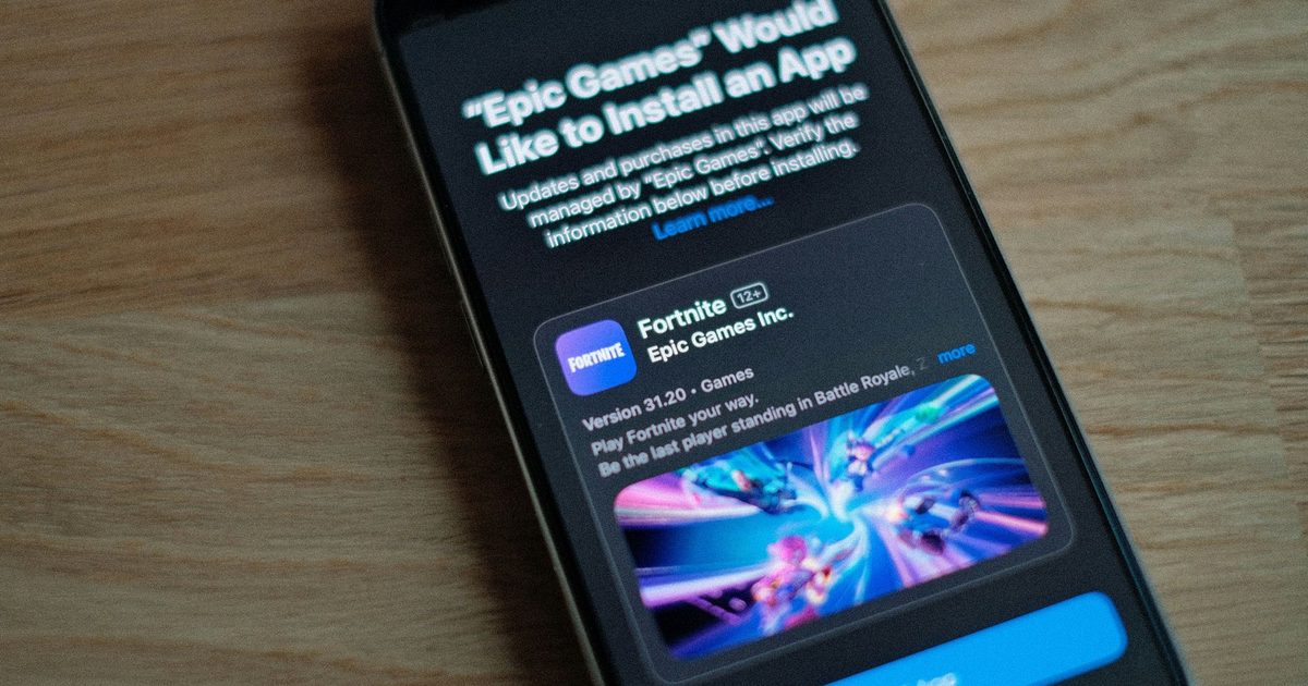
Fortnite is back on the App Store worldwide as Epic and Apple’s battle enters its final phase
After years of legal battles, platform bans, and public clashes over app store fees, Fortnite is officially returning to Apple’s App Store worldwide. Epic Games announced the move on Monday, calling it part of the “final battle” in its long-running fight against Apple’s App Store policies.
The return marks one of the biggest reversals in modern app store history. Fortnite was originally removed from Apple’s App Store in 2023 after Epic Games introduced its own payment system inside the app to bypass Apple’s commission fees, which can reach up to 30 percent. That decision triggered a years-long legal conflict that quickly became one of the most important antitrust battles in the tech industry.
Epic says global pressure is finally working
In its latest statement, Epic Games argued that increasing regulatory scrutiny around the world is forcing Apple to loosen its control over app store payments and alternative marketplaces. The company specifically pointed to growing pressure from regulators in regions such as the European Union, Japan, and the United Kingdom.
Epic claims Apple’s current app store model relies on what it calls “junk fees” and restrictive rules around payment systems and third-party app stores. According to the company, Fortnite’s return signals confidence that future rulings and regulations may further weaken Apple’s ability to enforce those restrictions globally.
The timing is also notable because Apple recently faced renewed criticism from US courts over how it implemented earlier injunctions tied to app store competition. A federal judge previously ruled that Apple violated portions of a court order requiring more flexibility around app downloads and payment systems.
Why this matters beyond Fortnite
This is bigger than just one game returning to iPhones. The Epic vs Apple dispute has effectively become a larger fight over how much control Apple and Google should have over mobile ecosystems. Developers have long argued that app store fees are too high and that platform owners unfairly restrict alternative payment methods and competing marketplaces.
The outcome affects not only games like Fortnite but also streaming apps, subscription services, AI apps, and digital marketplaces that rely heavily on mobile payments. Epic has already secured major concessions from Google earlier this year, leading to Fortnite’s return to Google Play worldwide after Google reduced fees and expanded billing flexibility on Android.
For users, this could eventually mean lower prices, more payment options, and greater freedom over how apps are installed and purchased on mobile devices.
What happens next
Despite Fortnite’s return, the broader legal and regulatory battle is far from over. Epic says it will continue challenging Apple’s restrictions around alternative app stores and competing payment systems. Meanwhile, regulators globally are still examining how companies like Apple and Google manage app distribution, fees, and platform control.
At the same time, Epic appears to be expanding its own ecosystem ambitions. The company continues growing the Epic Games Store on mobile devices, which is already available globally on Android and in select iPhone regions.
For Apple, Fortnite’s return may close one chapter of the dispute, but it also signals something larger: the era of tightly controlled mobile ecosystems is increasingly facing pressure from courts, regulators, and developers worldwide.
-
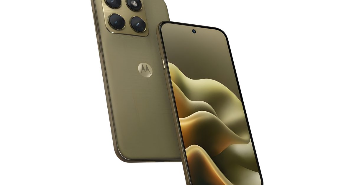
Motorola Edge 70 leak shows a phone that goes all gold and glittery
Motorola may drip out its next Edge smartphone in gold. A new leak from Digital Citizen claims to show the upcoming Motorola Edge 2026, and the design is the whole story for now. The leaked images show a warm champagne gold finish. The rear panel also has a fine woven texture, which should offer a brushed silk-like feel.
Gold, texture, and a whole lot of personality
Over the last couple of years, Motorola has leaned into designs that include a textured back. So the Edge 2026 model continues this tradition. The overall look seems more fashion-forward than the average Android phone. The brand has continued its partnership with Pantone, with some special edition models even using Swarovski crystals for a more premium finish.
To recall, the company has already released the Edge 70 in the global market as a super-slim mid-range phone. However, the upcoming Edge 2026 appears closer in both looks and size to the brand’s flagship Motorola Signature, which also debuted with a similar color and finish.
What else do we know?

The leaked design also shows a large square camera module in the top-left corner. It seems to house a triple camera setup that is housed on a raised metallic module. There are no confirmed camera specs yet, so this part is mostly visual. The size and layout suggest Motorola may be aiming higher than a basic midrange setup, but details like sensor size, telephoto capability, and stabilization are still unknown.
On the front, the device sports a flat display with minimal bezels and a centered punch-hole selfie camera. Motorola’s Edge line has often played with curved displays, but this model could be moving to flat screens since they are easier for typing, gaming, screen protectors, and avoiding accidental touches.
-

LG just announced a 1000Hz gaming monitor that could give you a real edge in FPS games
LG has unveiled the UltraGear 25G590B, the world’s first Full HD gaming monitor with a native 1000Hz refresh rate. The 24.5-inch display is built specifically for competitive gaming, where faster visual updates can translate directly to quicker reaction times in FPS titles.
Built for competitive FPS, not just benchmarks
The 25G590B delivers its 1000Hz performance natively at FHD (1920×1080) resolution, setting it apart from dual-mode monitors, like TCL’s recently announced 640Hz panel, that require resolution or screen-size adjustments to hit peak refresh rates. That means you train and compete under the same consistent visual conditions without toggling settings.
The monitor pairs its high refresh rate with LG’s Motion Blur Reduction Pro technology, which sharpens fast-moving objects to make tracking lateral movements easier during intense gameplay. The monitor features an IPS panel with a low-reflection film for consistent color reproduction and reduced glare.
Designed for the esports setup
LG says the 24.5-inch screen size is a deliberate choice, as it’s the format most commonly used in professional esports setups. It keeps key visual elements within the player’s natural field of view without requiring excessive eye movement.
The minimalist stand has a small base footprint to maximize mouse movement space, and calibration indicators that let players precisely replicate their preferred height, swivel, and tilt settings across different setups.
LG has not yet announced pricing or a release date for the 25G590B. The company says the gaming monitor is expected to launch in select markets in the second half of 2026, with availability in additional markets to follow later.