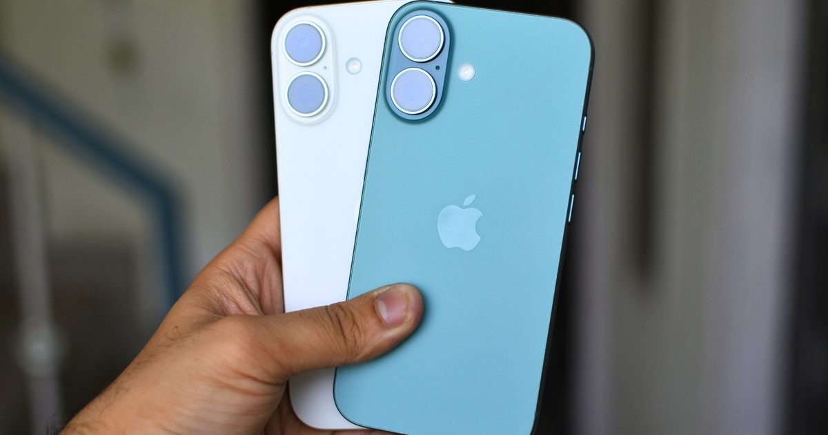
Apple’s strategic long-term supply agreements have kept iPhone and MacBook prices stable while rivals continue to hike their rates. However, that price stability may soon come to an end.
A recent report from the Financial Times indicates that memory expenses for iPhones could skyrocket from roughly 10% of total component costs today to nearly 45% by next year, marking a staggering increase of over 400%.
Consequently, this surge will likely trigger price increases across Apple’s entire product range, with the iPhone facing the most significant impact.
What is driving this trend?
In a familiar pattern, AI is the primary culprit. Tech firms constructing data centers for advanced AI models are outbidding consumer electronics makers for limited memory supply.
Companies like Nvidia and other AI infrastructure providers are reportedly securing capacity through massive upfront payments totaling billions of dollars. This has forced Apple, a company typically accustomed to setting the terms, into a sudden scramble to compete for the same memory chips.
 Sergei Starostin / Pexels
Adding to the pressure, the conflict in Iran has led to a shortage of essential materials for PCB manufacturing, which will further drive up consumer electronics costs.
Is Apple going to hike iPhone prices?
This is the challenge John Ternus faces, with no easy solution available. Passing the costs to consumers results in pricier iPhones, a move that is rarely popular, particularly in cost-sensitive regions like India and China, which Apple views as crucial for future growth.
 Apple
AppleAlternatively, absorbing the costs would significantly dent Apple’s profit margins, a scenario investors would likely dislike. However, since Apple already commands a premium for memory upgrades, it is arguably the one company best positioned to handle these additional expenses.
What does this mean for you?
If Apple decides to pass the costs on, anticipate your next iPhone to be significantly more expensive than the previous model. The launch strategy is already shifting, with only Pro models expected to debut in the typical fall timeframe.
Apple is also preparing to unveil the iPhone Fold, M6 MacBook Pros, and potentially an iPhone Ultra, all carrying higher starting prices. Hopefully, these premium devices will absorb the increased production costs, allowing more affordable options to remain at their current price points.
Regardless of the outcome, one certainty remains: the age of predictable iPhone pricing may be coming to a close.
 Snapchat
 Unsplash
 Rachit Agarwal / Techgeeks
 Malwarebytes
 DJI
DJI DJI
DJI
 Sony / Sony
 Apple
Apple
 Vikhyaat Vivek / Techgeeks
 Vikhyaat Vivek / Techgeeks
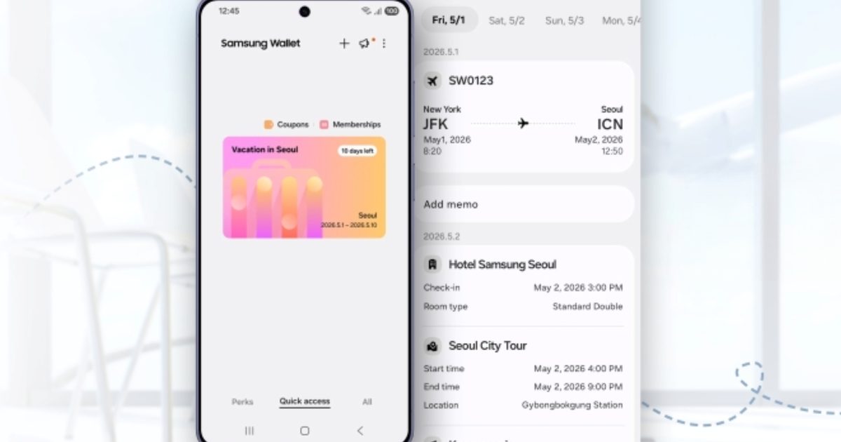
 Digital Home Key feature in Samsung Wallet Samsung
 Digital car key feature in Samsung Wallet Samsung
 Digital Home Key feature in Samsung Wallet Samsung
 Digital car key feature in Samsung Wallet Samsung
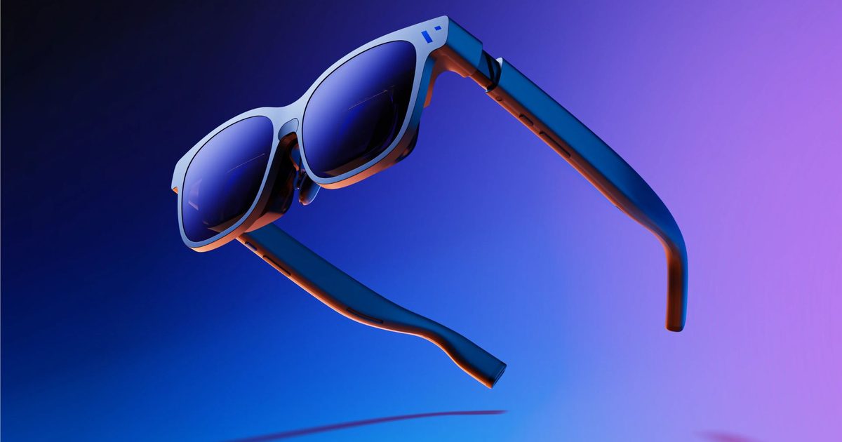
 VITURE Beast VITURE
 VITURE Beast VITURE
 VITURE Beast VITURE
 VITURE Beast VITURE