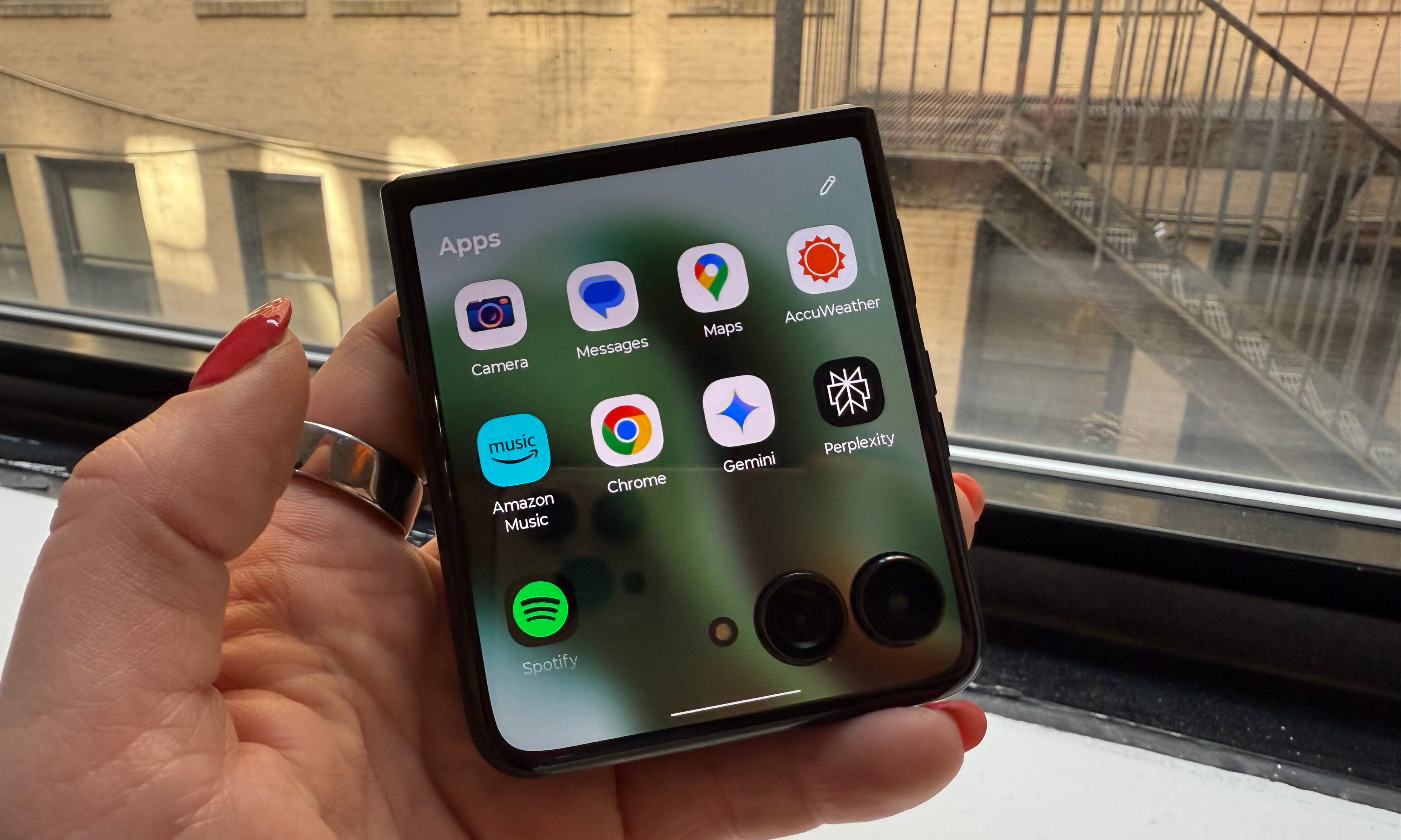
WhatsApp has fiercely defended its status as a free, no-nonsense online messaging app for over a decade, but a new subscription tier is muddying the waters.
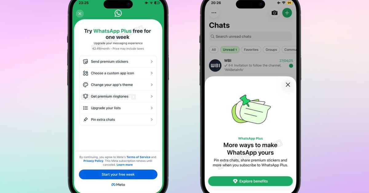
Meta is rolling out WhatsApp Plus, a paid subscription model, to a limited number of iPhone users using the latest version of the App Store.
So, what does WhatsApp Plus actually offer?
The list of benefits included as part of the WhatsApp Plus subscription sounds more like a cosmetic buffet than something useful. First, subscribers get 18 accent colors to replace the app’s signature green theme.
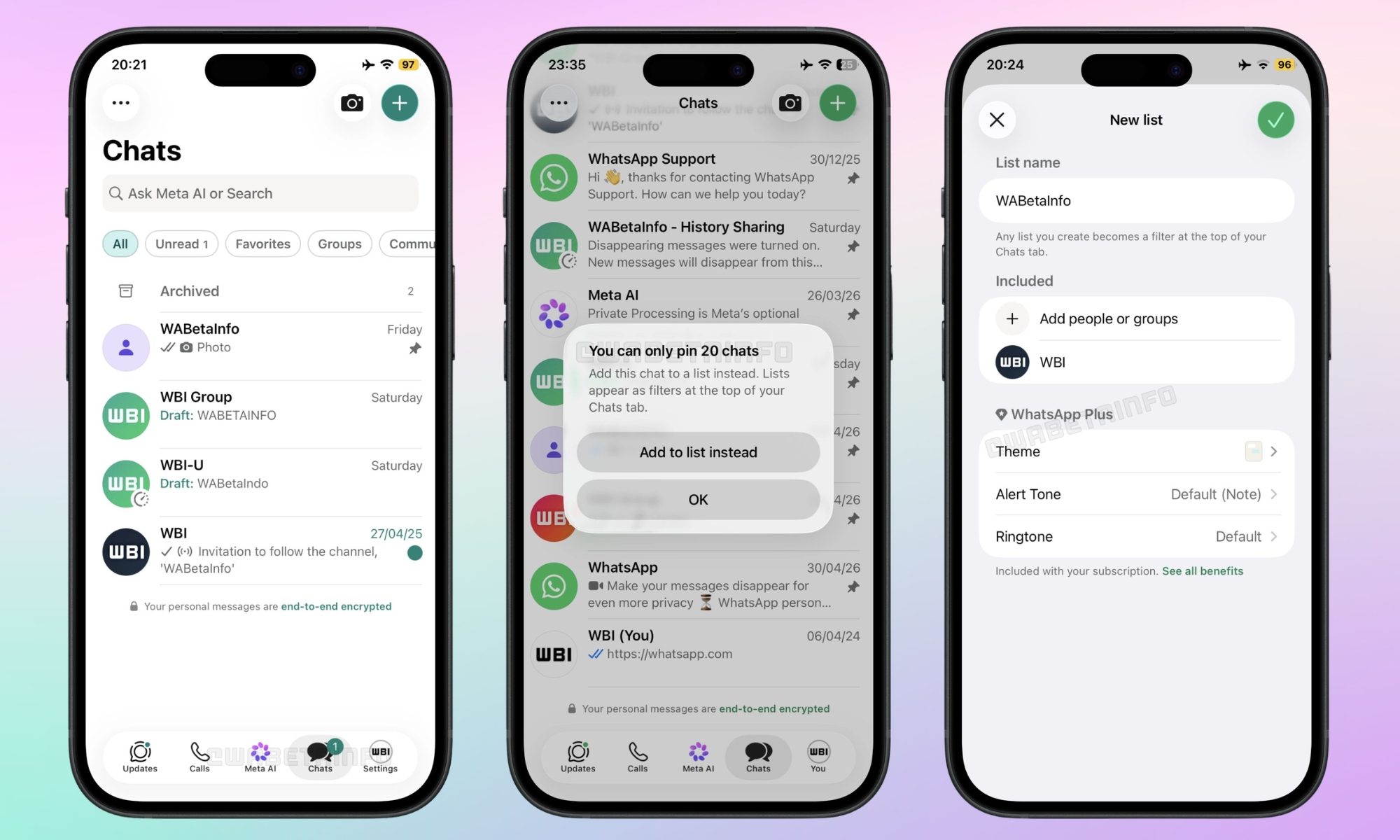
Then, there are 14 alternative home-screen icons to choose from. Additional perks include premium animated sticker packs, 10 exclusive call ringtones, and the ability to pin up to 20 chats (up from three), which is the only benefit I can imagine using.
What’s more is that subscribers can also apply unified themes and alert tones across entire chat lists, but the core WhatsApp experience, including E2EE messaging, calls, video, and status updates, remains the same.
How much does the WhatsApp Plus subscription cost?
In European markets, the subscription is priced at around €2.49 per month. While the US pricing hasn’t been revealed yet, it could land around $2.49 to $2.99. A free trial, for a week or a month, depending on the region, may also be available for eligible users.
For now, the WhatsApp Plus subscription is billed monthly via the App Store. For now, WhatsApp Business accounts can’t access the subscription, which is all the more questionable, since such users are more likely to pay for paid tiers.
What doesn’t sit well with me is that several WhatsApp Plus headline features are already available on rival messaging platforms for free; no monthly fee required.
Competitor apps offer chat background customization for free
Signal recently added a paid tier for cloud backups (removing the 45-day restriction on media storage), but even so, it lets users set custom chat wallpapers at zero cost. Apple’s native messaging service, iMessage, also offers free chat customization inside the Messages app, including per-contact photo backgrounds.
You see? What WhatsApp is charging for is already available in the base package of its competitors.
The paid tier should have included more useful features
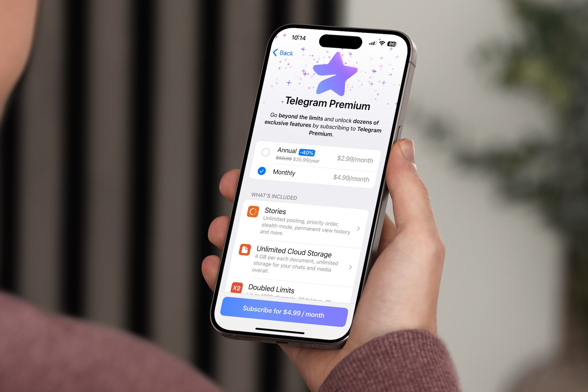
The Telegram Premium subscription, which costs $4.99 per month in the US, raises the file upload limit from 2GB to 4GB, provides voice message transcription, real-time chat translation, boosts download speeds, and allows users to join up to 1,000 Telegram channels.
These, in my opinion, are functional updates that change the way you use the app. WhatsApp Plus, however, only changes how the app looks, for the most part.
WhatsApp Plus, I’d say, isn’t a bad product. It’s a perfect add-on for enthusiasts who might want a purple app icon and animated stickers. However, for value-seeking buyers like me, the competition is offering more, either for less or nothing at all.
If you have been waiting for a Ghost in the Shell anime that truly captures the essence of the original manga, here’s some good news. Science Saru has officially confirmed that a new Ghost in the Shell anime will premiere on July 7, 2026, with a new trailer dropping alongside the announcement.
— 攻殻機動隊【公式】GHOST IN THE SHELL official (@thegitsofficial) May 11, 2026
See More
The series will stream worldwide on Amazon Prime Video, with Japan getting early exclusive access. Before the global release, the first two episodes will screen at the Annecy International Animation Film Festival in France, running June 21 through 27, where the creative team will also take the stage to discuss the production.
What is The Ghost in the Shell anime about?
Set in 2029, the story follows Motoko Kusanagi, a full-body cyborg who leads an elite combat unit. Working alongside Daisuke Aramaki of the Ministry of Home Affairs, the two establish Public Security Section 9, known as Shell Squad. It is a tactical organization built to take on cybercrimes and international conspiracies. Lurking in the background is a mysterious, unidentified hacker called the Puppet Master.
This adaptation feels different from everything that came before
Here is the thing that genuinely excites me about this one. Every previous Ghost in the Shell adaptation, including the beloved 1995 film, Stand Alone Complex and and the Scarlett Johansson-led live-action film from 2017, took significant creative liberties with Masamune Shirow’s original manga.
The 1995 movie narrowed its focus to AI and consciousness. Stand Alone Complex came closer but still made notable changes, swapping the Fuchikomas for Tachikomas, among other departures.
Science Saru, the studio behind Dandadan and Scott Pilgrim Takes Off, is producing the Ghost in the Shell anime. Based on everything shown so far, the new anime actually looks like the manga, from the character designs to the hardware and the overall tone.
The studio’s track record with faithful manga adaptations, particularly Keep Your Hands Off Eizouken! and Inu-Oh, gives real reason to believe they will pull this off. For years, people said a true adaptation of Shirow’s manga was impossible but Science Saru seems ready to prove otherwise this July.
There is no host narrating your every move, no studio audience gasping when you waste a guess on a word, and absolutely nobody cheering you on. Just you, the word, and the slightly smug satisfaction of getting it right under three attempts.
However, The New York Times wants to change that by bringing it to NBC primetime. Wordle is becoming a game show, hosted by Today anchor Savannah Guthrie and produced by Jimmy Fallon, with filming starting this summer and a 2027 air date on the cards (via BBC).
So what would the Wordle TV show look like?
Details are still thin, but what we do know is that the show will be described as “fast-paced” and a “great family game.” It will be filmed in Manchester, England, and will replicate Wordle’s signature typeface and color scheme.
For the NYT, this is a first. The company has never partnered with a broadcast network for a primetime entertainment show before. It is also a telling sign of where the company is headed.
Its Games division, which includes Wordle, the Crossword, and Spelling Bee, is one of its most popular products, with users playing over 11 billion puzzles across all NYT games last year alone. Turning Wordle into a TV franchise makes business sense. Whether it makes creative sense is a different question.
I’ve been playing Wordle for years, but this announcement feels like a loss
Wordle’s appeal is rooted in its ritual. You do it once a day, the same word as everyone else, and then you share your little green and yellow squares with whoever is in your group chat. That’s all there is to it, and this simplicity is the whole point.
A neuroscientist once observed that people have a remarkably good radar for sensing when something online is designed to keep them hooked, sell them something, or quietly profit from their attention. Wordle’s quiet nature, with no ads, no push notifications, and a simple website, is a big part of why it worked.
Josh Wardle, the software engineer who built the original game, said that Wordle demonstrated that the internet could be about something other than money. A primetime NBC game show with a studio audience, a celebrity host, and a cash prize is about as far from that original spirit as you can get.
The show might end up being entertaining for many, since Guthrie is a genuine Wordle devotee, and Fallon knows how to make a crowd have fun. But the version of Wordle that is coming to your TV screen next year may not be the one you fell in love with over your morning coffee. That one was always just for you.
I hate scalpers. I especially hate scalpers when they swarm gaming hardware that already has limited availability. They buy it before regular customers and gamers can get a fair shot, and then relist it at cartoonish prices for the people who actually wanted to use it. We’ve seen this issue time and time again, but Valve’s latest move might be the best anti-scalper weapon I’ve seen in a while.
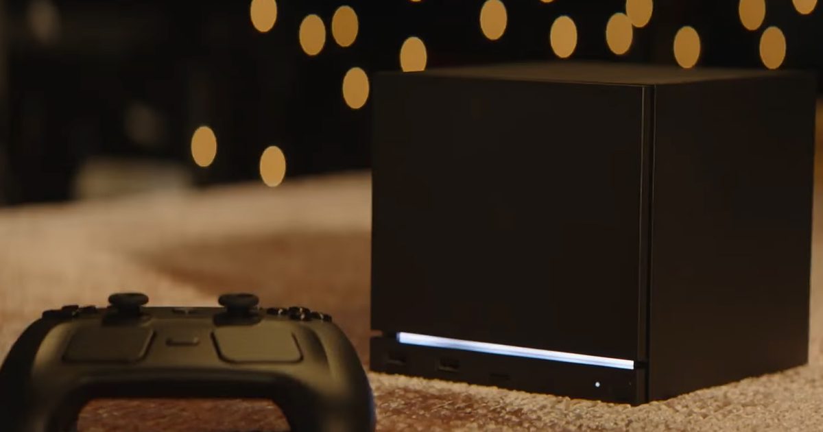
Steam’s database now suggests Valve may already have a reservation queue system prepared for the upcoming Steam Machine. The discovery reportedly comes from a recent Steam update spotted by user Pepeizq, where references to multiple Steam Machine packages appeared inside the same reservation system code used for the Steam Controller.
How the Steam Controller inspired this move
The new Steam Controller launched on May 4, and demand immediately overwhelmed supply. In less than an hour, reports claimed that the new Valve hardware was completely sold out, with some regions even seeing stocks disappear in just over half an hour. Then came the usual nonsense. Scalpers started appearing on platforms like eBay at heavily inflated prices. Some reports claimed that the listings went as high as $349.99, which is far above the controller’s $99 original price.
This was the worst possible news for actual gamers who wanted to get their hands on the new gaming hardware at launch. Even if you show up on time, the stock disappears in minutes, being held hostage by people who never cared about the product in the first place. Valve’s response? A great reservation queue that actually makes the Steam Controller accessible again.
The new system gives eligible users a place in line, then emails them when a unit becomes available. Buyers get 72 hours to complete the purchase before the controller is offered to the next person. Eligibility is also restricted to Steam accounts in good standing that made at least one purchase before April 27, 2026, and reservations are limited to one controller per account.
I won’t call this foolproof entirely, but it is far better than turning every restock into a refresh-button war. Giving actual gamers with Steam accounts a shot at buying their new hardware also adds to the strong community loyalty that Valve has built over the years.
Steam Machine needs this from day one
In the reservation system code, four Steam Machine packages were spotted along with references to two Steam Frame packages and existing Steam Controller and Steam Deck package references. Meaning, there might be four Steam Machine entries that are likely related to multiple configurations and bundles. It makes sense since Valve has already confirmed a 512GB and 2TB model.
Keep in mind that this is just database evidence and not an official Valve announcement. But just like the scalping issue that plagued the initial Steam Controller release, the company should be better prepared for the big demand its Steam Machine will likely attract. So this time around, Valve doesn’t need to wait until after launch chaos for a fairer system.
Unlike the new controller, the Steam Machine isn’t just an accessory and is Valve’s next major swing at living-room PC gaming. And if the pricing, performance, and SteamOS land, there could be a huge audience for the hybrid gaming machine. All of this makes it pretty obvious that the Steam Machine will most definitely be the next target for scalpers.
I understand why lining up digitally for a product can be frustrating, but I would rather wait in a transparent queue than lose a launch to bots and resellers.
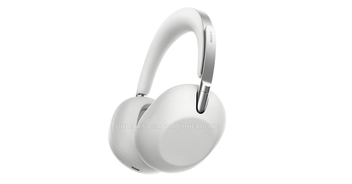
We recently reported that Sony could be working on a new pair of premium headphones that might make even the AirPods Max feel relatively affordable. Now, fresh leaked renders shared by Steve H. McFly, in collaboration with Android Headlines, are giving us our first proper look at what’s reportedly called the ColleXion headphones. And honestly? They look very Sony. The Black and White variants instantly reminded me of the Sony WH-1000XM6, especially with the clean, understated design language. Sony seems to be leaning even harder into minimalism this time around, and personally, I think that works in its favor. A lot of headphones today try too hard to look futuristic or flashy. These, at least from the renders, feel far more refined and grown-up.
What is more interesting, though, is the hinge redesign. The XM6 received its fair share of criticism over hinge durability concerns, and according to the report, Sony is reportedly trying to address that with an entirely new hinge mechanism on the ColleXion. From the renders alone, the design does look noticeably different, so there is a good chance Sony is finally taking those complaints seriously.
Sony’s minimalist era looks dangerously expensive
There is also speculation that Sony could move towards a more premium material finish, possibly using leather or other higher-end materials instead of the matte plastic used on previous models. Right now, though, it is difficult to say anything with certainty from renders alone. Product renders have a tendency to make almost everything look more luxurious than it actually is. We will have to wait for hands-on impressions before drawing conclusions there. That said, the White color variant already has my attention. It looks clean, minimal, and surprisingly elegant without trying too hard. It is the kind of gadget aesthetic that feels premium quietly, instead of screaming for attention, and I genuinely prefer that approach.
As for pricing, rumors currently suggest these headphones could cost somewhere around $649. If that turns out to be true, Sony is clearly positioning the ColleXion well into luxury territory. Whether people are willing to spend that kind of money on headphones is a completely different conversation, especially when premium audio products are already getting absurdly expensive. For now, though, these are still early leaks, and Sony itself has not officially confirmed anything around the launch, specifications, or pricing. So yes, it is best to keep expectations in check and take everything with a grain of salt. Still, based on the renders alone, these headphones already look far more interesting than I expected.
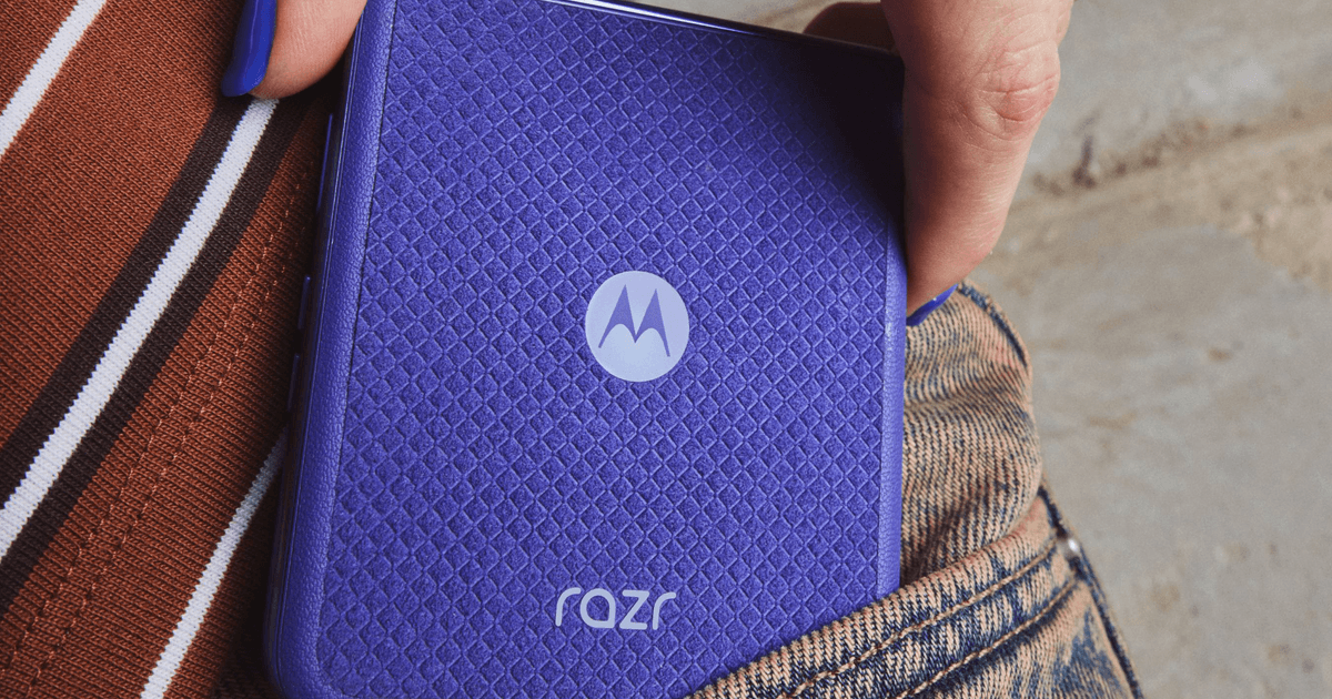
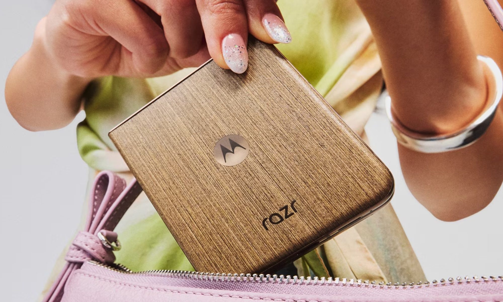
I’ll be blunt: $1,500 is a lot of money to spend on the Razr Ultra, a clamshell phone that folds in half. In fact, it’s a lot of money to spend on any smartphone, especially when a Galaxy S26 Ultra or iPhone 17 Pro Max costs less and still leaves a few hundred dollars in your pocket, or throwing in a couple of hundred bucks can get you a full-fledged book-style foldable.
For me, the Razr Ultra doesn’t quite make a strong case at $1,500. In isolation, it’s a genuinely impressive flip phone that gets all the basics right and delivers the premium experience you’d expect at this price. The Alcantara back, the 5,000-nit display, the silicon-carbon battery, and the dual cameras on the back make it sound like a complete package.
However, it’s when I look at the price tag and what that kind of money can get me elsewhere that something feels off. I know Motorola attributes the $200 price hike to surging memory and component costs, and that’s a real industry-wide problem. But increasing the price while barely upgrading the hardware, to $1,500, no less, is exactly the kind of move that makes you stop and ask what else you could get for the same money.
The clamshell foldable was never about specs, and that’s the problem at $1,500
Here’s the thing about flip phones: they were never about top-tier specifications. The appeal of a clamshell foldable, by design, is the satisfying snap of the hinge, folding a normal-looking phone in half, slipping it into your pocket, and watching heads turn when you flip it open at a coffee shop or a family dinner. It’s the tactile feeling and the wow factor.
I’d never buy a flip phone expecting it to set a new high score on synthetic benchmarks or grind through a three-hour gaming session. But that’s where the $1,500 price tag creates a problem; it breaks the years-long rule of “the higher the price, the better the specifications.”
The Razr Ultra’s primary differentiator has always been its form factor and Motorola’s passionate approach to materials and design, not the chipset. At $1,500, the price is writing checks that the spec sheet can’t cash. And even when you do look at the specs, the Razr Ultra 2026 is tough to justify.
You’re paying a revised price for a barely revised spec sheet
Whenever there’s a new phone on the market, I first compare its spec sheet to its immediate predecessor, and then to its immediate rivals. While differences within the brand aren’t much, often enough to justify a yearly upgrade, the Razr Ultra 2026 isn’t even trying.
The Razr Ultra 2026 is basically the Razr Ultra 2025 with a slightly larger battery (4,700 mAh vs. 5,000 mAh), new color options (Orient Blue Alcantara, Cocoa wood veneer), and Gorilla Glass Ceramic 3 protection on the cover screen. That’s the entire change log on a smartphone that costs $200 more than its predecessor.
Everything else, including the 4-inch cover screen, the 7-inch main foldable screen, the Snapdragon 8 Elite chipset, memory and storage configuration (16GB + 512GB), and cameras (triple 50MP sensors), is carried over from the 2025 model.
What makes this even harder to stomach is that the Razr Ultra 2025 is currently up for grabs at Motorola’s website for $799.99, for the 1TB variant, with a free pair of Moto Buds 2 Plus. It could be a limited-time deal before the stock runs out, but selling the same chip, same display, with twice the storage for nearly half the price is simply absurd.
It could be the difference in the price of last year’s components and this year’s that has led to this, but for me, this makes the Razr Ultra 2026 a head-scratcher at $1500.
If you really want a flip phone, I’d recommend these two options
If you want a Motorola flip phone, the Razr+ 2026 at $1,099 is where I’d point most buyers first. It costs $400 less than the Ultra, and delivers the same core clamshell experience with the titanium hinge, 4-inch cover screen, an IP48 rating, and clean Hello UI based on Android 16.
The Snapdragon 8s Gen 3 handles everything most flip phone buyers actually do, but more importantly, it folds the same satisfying way the $1,500 Razr Ultra does. Do you leave anything on the table? Yes. A brighter display, a more benchmark-friendly chipset, and the Alcantara finish. But none of that changes the fact that it folds in half just as well.
If you’re open to crossing the aisle, the Samsung Galaxy Z Flip 7 is available at a discounted price of $899.99 for the 256GB variant or $1,099.99 for the 512GB model. You might argue that its Exynos 2500 chip isn’t as powerful as the Snapdragon 8 Elite, and you’d be right, but the phone delivers a capable, smooth daily experience with no major drawbacks.
You’ll get another six years of software upgrades, the Galaxy AI suite, and the One UI’s feature-loaded ecosystem. I’d say that the Flip 7 is much more pocket-friendly, both literally (it’s thinner than the Razr+) and figuratively.
Ultimately, you’re paying for the joy of folding a normal-looking phone in half, and you can get around $1,000.
At $1,500, you can get a phone that unfolds into a tablet
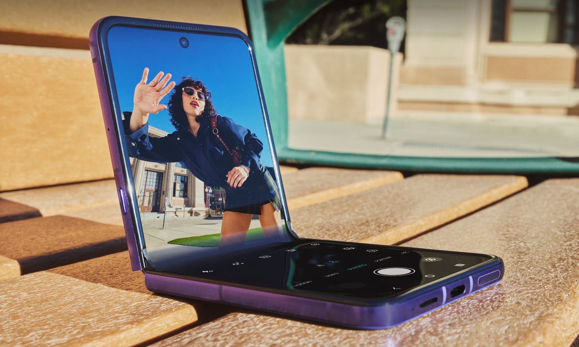
That’s the Galaxy Z Fold 7, Samsung’s most refined book-style foldable to date. Right now, it’s available for $1,599 for the base 256GB variant, $400 off its launch price, which makes it one of the better deals in the foldable space right now. I’ve used the Fold 7, and it’s the practical versatility behind the folding mechanism that earns its price, even when it retails close to $2,000.
And before you raise an eyebrow, I want to be clear: this isn’t a spec argument. The premium goes toward the versatility the form factor offers. The ability to use the cover screen like a regular phone — answering calls, dropping quick messages, checking navigation — and then unfolding into a tablet-like screen for watching content or running multiple apps at once, is something no flip phone has ever done, nor ever will.
If you can’t compromise on the clean Android experience, the Pixel 10 Pro Fold is worth a look at $1,799 (unlocked, 256GB) at the Google Store, or $1,699 at Best Buy, if you’re willing to connect it to Verizon or AT&T. For the price, you get Google’s iconic camera science, a deeper Gemini AI integration, and software support until 2032, all with an 8-inch foldable screen.
Fold-style phones are the current epitome of smartphone technology, and the fact that you can get them around the same price or by stretching your budget by a few hundred dollars undersells the $1,500 Razr Ultra even more.
For $1,500, you can choose from the best flagships available in the market
If you’re even a little hesitant about spending a fortune on a flip-style foldable, or the book-style kind doesn’t excite you either, maybe you’re second-guessing your usage habits, or whether a foldable would hold up to them in the long run. Either way, $1,500 can buy you the absolute best flagship.
The iPhone 17 Pro Max (256GB) at $1,199 (which is $300 less) is the gold standard for anyone living inside Apple’s ecosystem. Top-tier performance for heavy workloads, ProRes Log and 4K 120fps video, an excellent 4x telephoto for portraits, a battery that easily clears a full day, and Continuity features across iOS, macOS, and iPadOS that genuinely make the whole greater than the sum of its parts.
The Galaxy S26 Ultra at $1,299 (which is $200 less) is Samsung’s most feature-loaded flagship in 2026, headlined by the Privacy Display, the fastest Qualcomm chip on the market, and an ever-expanding Galaxy AI suite. It also sports one of the most versatile camera arrays on any smartphone, with four rear sensors, and comes with a built-in S Pen.
For Android power users, this is the one to beat. I just checked, and Samsung is offering a $200 discount on the launch price. The 256GB variant is available for $1,099.99.
The Pixel 10 Pro XL at $1,199 (which is $300 less) is Google’s answer to what a smartphone can do when the hardware and software are built by the same team. The cameras are legendary for natural, true-to-life photography, while Gemini-powered editing adds a genuine element of fun.
Clean Android, excellent battery life, and long-term software support round out a package that’s hard to argue with.
And then there’s the OnePlus 15 at $899 (which is $600 less than the Razr Ultra), which, in my honest opinion, has no business being this good at this price. It outlasts every flagship on this list with a two-day battery, delivers unparalleled gaming performance with 165fps support for compatible titles, and runs OxygenOS loaded with features that actually get out of your way.
The OnePlus 15 is the most capable value flagship in the United States right now.
None of these smartphones folds, vertically or horizontally, but every single one offers the best of what a smartphone from the respective brands is in 2026.
So, should you spend $1,500 on the Razr Ultra?
If the flip form factor is non-negotiable, you go caseless, spend meaningful time outdoors, and shoot a lot of video content, the Razr Ultra earns its place. Price tag aside, it’s a genuinely impressive phone for a very specific kind of buyer.
However, if you only want to experience the clamshell form factor and you’re getting a flip phone for the joy of flipping it open in front of friends, colleagues, and family members, save some money and go with the Razr+ 2026 or the Samsung Galaxy Z Flip 7.
The book-style foldables unlock a totally different use case, one that’s difficult to fully appreciate until you try it for yourself, but they’ll ask you to stretch the budget a bit further. And if you’re hesitant about spending a fortune on a technology you haven’t tried before, the slab-style flagships are where you simply can’t go wrong.
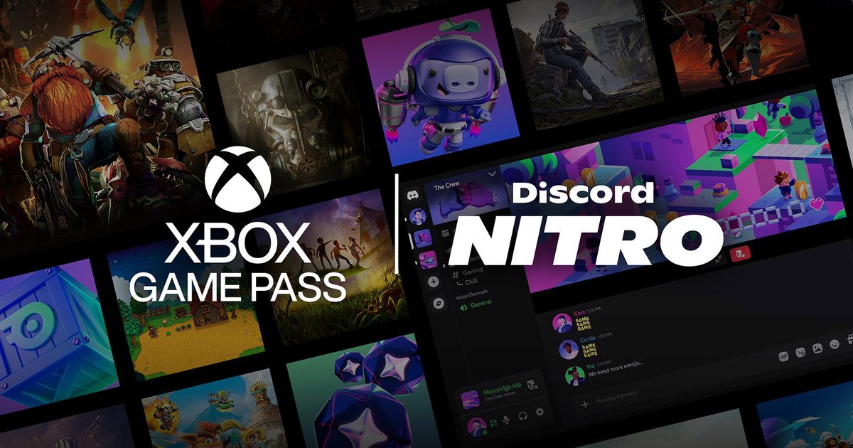
Discord and Xbox have teamed up several times over the years, usually with Xbox offering Discord Nitro perks through one of its own subscription plans, such as the Game Pass Ultimate. This time, the arrangement is flipped. Discord is now offering Xbox Game Pass “Starter Edition” as a reward for buying Nitro.
What does Nitro get you now?
Until now, Nitro has mostly been about making Discord better to use every day. Subscribers paid for perks like custom profiles, animated avatars, profile banners, HD video streaming, and bigger file uploads, among other features. That remains part of the package, but the new Game Pass perk gives Nitro a much stronger appeal.
Is Nitro becoming a gaming bundle?
That certainly seems to be the direction. Nitro Rewards also offers discounts of up to 30% on Logitech G products, 15% off SteelSeries gear, and 20% off KontrolFreek, with offers expected to rotate over time. Nitro members will also receive 250 Orbs every month, along with an Orbs multiplier for completing Quests.
Nitro Rewards will roll out over the next few weeks in eligible regions, so some subscribers may not see the new perks right away. The Game Pass Starter Edition also appears to be aimed at Nitro members who do not already have an active Xbox Game Pass subscription. Still, it makes Nitro a lot easier to sell, and for Xbox, it is a smart way to put Game Pass in front of players who are already using Discord to hang out. So, it looks like a win-win situation for both parties.
TikTok is officially putting a price on skipping ads. The platform has announced TikTok Ad-Free, a new paid subscription for UK users that removes ads from your feed for £3.99 a month, roughly $5.40.
Starting this week, TikTok will begin notifying eligible users about the option via pop-up notifications, rolling it out gradually over the coming months to anyone aged 18 and over.
What do you actually get for £3.99 a month on TikTok?
Subscribers to TikTok Ad-Free won’t see ads across key areas of the app, including the For You feed. TikTok also promises not to use your data for advertising purposes. That second part matters more than it might seem.
The subscription is TikTok’s way of complying with the UK’s data protection laws, which require platforms to get explicit consent before using personal data for targeted advertising. By offering a paid opt-out, TikTok can argue that users have a genuine choice.
There is another catch worth knowing. Even if you pay, you will still see posts from creators who are sponsored or paid to promote products; those are usually tagged with “#ad.”
The platform has been testing this idea since 2023, when leaked screenshots showed some users being offered a similar option at $4.99 a month, hinting at a possible US expansion down the line.
If you don’t pay, TikTok’s free version remains the same, with personalized ads and all, although you can still adjust how targeted they are through Settings. TikTok hasn’t said whether or when TikTok Ad-Free will expand beyond the UK.
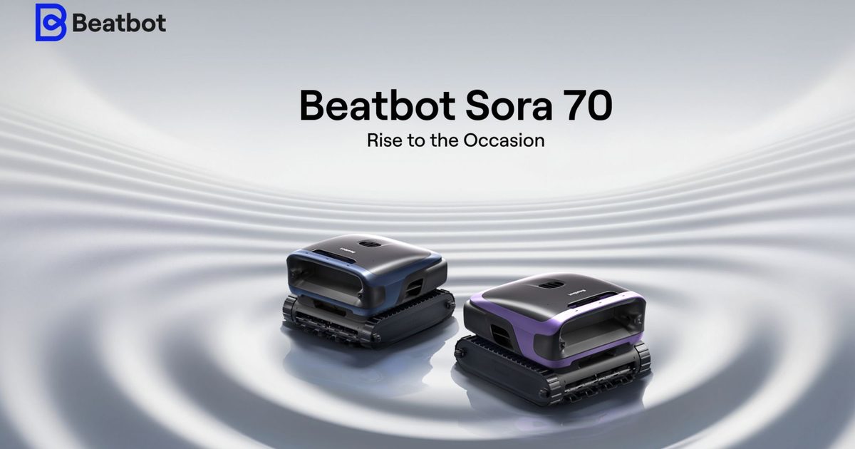
Summer is when pools move from being part of the setup to becoming part of everyday life. What starts as a manageable routine quickly turns into regular use, whether it is weekends with family, hosting friends, or simply spending more time outdoors. It is also when maintenance stops being occasional and begins to demand consistency, which is where most systems start to fall short.
Surface debris returns faster than expected, shallow areas remain inconsistent, and steps that were meant to be automated begin to come back into the routine. What looks simple at the start of the season starts to take more time than it should, especially when the pool is being used more often.
Beatbot positions the Sora 70 as a way to remove that friction altogether. Built as a 4-in-1 cordless system, it brings together water-surface cleaning, waterline scrubbing, wall climbing, and floor cleaning into a single workflow that reduces the need for repeated intervention. More than that, it fits into how pools are actually used during the season, making it a practical upgrade for homeowners and a high-value gift for those investing in easier, more usable outdoor living. With the Anniversary Campaign running from May 9 to 25, it arrives at a point where that shift becomes both relevant and easy to act on
A 4-in-1 system designed to replace fragmented pool cleaning
Most robotic pool cleaners still leave gaps in how cleaning is handled. Floors are covered, walls are managed, but surface debris, shallow platforms, and waterline buildup are often left to separate tools or manual effort. That fragmentation becomes more visible with regular use, when no single cycle fully resets the pool and maintenance starts to return in smaller, repeated steps.
The Sora 70 is designed to replace that fragmented approach. Its 4-in-1 system brings together water-surface cleaning, waterline scrubbing, wall climbing, and floor cleaning into a single cycle, reducing the need for multiple devices or follow-up passes. Instead of dividing the process, it handles the pool as one continuous environment, which is where most systems tend to fall short.
In practical terms, this shifts the experience from managing individual cleaning tasks to relying on a system that delivers complete coverage in one run. That reduction in manual effort is what makes it a smarter upgrade, and also what allows it to stand out as a more considered purchase for homeowners looking to simplify how their pool is maintained.
Designed to handle the areas most systems miss
In many pools, the challenge is not cleaning the obvious surfaces but reaching the areas that are easy to skip. Shallow platforms, tanning ledges, and multi-level sections often sit outside the effective range of standard robotic cleaners, which leaves parts of the pool inconsistent even after a full cycle.
The Sora 70 addresses this through its dual SonicSense ultrasonic sensors, which allow it to navigate shallow-water zones as low as 8 inches. This enables it to move across varied pool layouts without breaking the cleaning path, maintaining continuity from surface to floor.
That consistency removes the need for manual correction after each cycle, which is where most of the effort tends to go. For users looking for reliable cleaning that holds up through regular use, this is where the system begins to justify itself not just as an upgrade, but as something that delivers ongoing value over time.
JetPulse turns surface cleaning into an active process
Surface debris is one of the most persistent issues in pool maintenance, especially during summer use when leaves, dust, and particles return quickly. Most robotic systems rely on passive movement, collecting debris only when it drifts into range, which often requires multiple cycles to achieve visible results.
The Sora 70 takes a more active approach through its JetPulse system. A twin-jet mechanism generates directed water flow that pulls floating debris toward the intake, allowing it to be captured earlier in the cycle rather than after repeated passes. This shortens the time between cleaning and usability, which matters more during periods of frequent use. Instead of waiting for the pool to settle, it stays ready with fewer interruptions, supporting a setup that is easier to maintain without repeated intervention.
HydroBalance maintains consistent suction across the entire cycle
In many robotic cleaners, suction performance drops as the cleaning cycle progresses, which leads to uneven results and often requires additional runs to fully clear the pool. That inconsistency becomes more noticeable during regular use, when debris accumulates quickly and cleaning needs to be reliable rather than repeated.
The Sora 70’s HydroBalance system is designed to maintain a steady flow throughout the cycle. A center-mounted pump creates a direct, low-resistance path, while a high-efficiency motor sustains 6,800 GPH suction without drop-off. The 6.7-inch intake reduces clogging, and the bottom-hugging design helps retain suction close to the surface being cleaned. This allows debris to be removed in a single pass, reducing the need for additional cleaning cycles and making the system easier to depend on as part of a regular pool routine.
Filtration that supports both routine cleaning and higher-precision results
Alongside debris removal, the Sora 70 is built to handle the difference between visible cleaning and actual water clarity. A 6L, 150-micron debris basket captures leaves, insects, and larger particles during everyday use, allowing longer cycles without frequent emptying and keeping routine maintenance consistent.
When finer particles become more noticeable, particularly during periods of frequent use, an optional 3-micron ultra-fine filter captures dust, pollen, and algae spores that are not always visible during standard cleaning cycles.
By maintaining the same cleaning process while improving the level of filtration, the system avoids adding extra steps while delivering a more refined result. That consistency becomes part of its long-term value, particularly for homeowners who want a setup that continues to perform without added effort, and for those considering a more considered purchase that improves how the pool is maintained over time.
Retrieval that does not interrupt the process
Retrieval remains one of the most inconvenient parts of robotic cleaning. The process often requires manual handling at the end of each cycle, which breaks the sense of automation. The Sora 70 addresses this through Smart Water-Surface Parking and One-Touch App Retrieval. At the end of a cycle, it rises to the surface and moves toward the pool edge, where it can be accessed without additional effort.
The SmartDrain system releases excess water before lifting, reducing weight and making handling easier. This keeps the experience consistent from start to finish, without reintroducing effort at the final step, which is often where automation tends to fall apart.
Built for longer use, not just shorter cycles
Pool cleaning needs to keep up with usage, especially during summer when the pool is used more frequently. The Sora 70 is powered by a 10,000 mAh battery that supports up to seven hours of surface cleaning or five hours of full-pool cleaning, allowing it to cover up to 3,230 square feet in a single cycle.
Its cordless design removes the need for cable management, improving ease of use in active outdoor environments. This makes it easier to treat as part of a regular setup rather than a task that needs planning, which is where most systems start to feel limiting.
A shift that fits how pools are used through the season
Pool usage changes once the season is in full swing, with expectations moving beyond basic cleaning toward maintaining a space that stays ready without repeated attention. Bringing surface cleaning, walls, and the pool floor into a single system allows the Sora 70 to remove the need for managing separate steps, keeping the overall setup consistent even during periods of regular use without adding to the workload.
That difference becomes more relevant when the decision moves from solving an immediate problem to choosing a system that continues to deliver over time. For homeowners upgrading an outdoor space, the Sora 70 works as a high-value addition that improves how the pool is used without adding complexity. It also translates naturally into a premium, practical gift for pool owners or new homeowners, where the value comes from reducing a recurring task rather than introducing another one.
With Anniversary pricing from May 9 to 25, where it is available at $1,149, down from $1,499, the timing aligns with peak pool use. The shift toward less manual work and a more reliable setup becomes easier to act on, making it a relevant upgrade for the season as well as a considered purchase that continues to deliver beyond it.
Sora 30: a smart upgrade for consistent everyday cleaning
Building on the approach established by Beatbot’s Sora 70, the Sora 30 focuses on the parts of pool cleaning that define everyday use, delivering consistent results without moving into full 4-in-1 automation. It is designed for users who want dependable cordless pool cleaning that reduces manual effort while keeping the system simple to operate.
Its 3-in-1 cleaning across floor, walls, and waterline ensures routine maintenance is handled in a single cycle, with dual roller brushes supporting stable wall climbing and consistent contact across surfaces. The filtration system captures both larger debris and finer particles within the same pass, helping avoid repeat runs, while a runtime of up to five hours allows most residential pools to be cleaned without interruption.
Coverage extends to shallow zones such as steps and ledges, and smart surface parking brings the unit to an accessible point for retrieval, with the fully cordless design removing cable management altogether and making repeated use easier to manage over time.
As part of Beatbot’s Anniversary offer from May 9 to 25, the Sora 30 is available at $699, down from $999, positioning it as a clear step up from entry-level cordless pool cleaning. It works both as a smart upgrade for everyday use and as a practical, high-value gift for pool owners or new homeowners, delivering less work, more pool time, and a setup that holds up through regular use.
AquaSense X: a premium system for low-intervention pool care
Extending beyond the Sora series, Beatbot’s AquaSense X is designed for users who want pool cleaning to operate with minimal involvement, moving from consistent maintenance into a more automated, system-led approach.
It brings complete, all-zone coverage into a system built around advanced pool robotics, combining floor, walls, waterline, and surface cleaning with filtration and water clarification. Automated debris handling reduces the need for manual emptying, while intelligent navigation ensures consistent coverage across the entire pool without requiring supervision, shifting the experience from managing cleaning cycles to relying on a system that runs with minimal input. This makes it particularly relevant for larger pools or setups that see frequent use, where consistency and reduced intervention matter more than isolated cleaning performance.
As part of Beatbot’s Anniversary offer from May 9 to 25, the AquaSense X is available at $3,999, down from $4,250, positioning it as a flagship upgrade within advanced pool robotics. It also works as a premium, high-value gift for homeowners investing in outdoor spaces, delivering less work, more pool time, and a system that continues to perform without constant attention.
AquaSense 2 Ultra: AI-powered cleaning for complex pool environments
Positioned within the premium segment, the AquaSense 2 Ultra introduces HybridSense AI-powered mapping, enabling precise navigation, obstacle detection, and adaptive path planning across complex pool layouts. Its 5-in-1 cleaning system covers surface, floor, walls, waterline, and water purification, while HybridSense AI mapping helps reduce cleaning time by up to 50% through more efficient coverage. ClearWater natural clarification improves water clarity alongside debris removal, and side brushes enhance surface cleaning performance, ensuring that both visible and fine particles are addressed within the same cycle.
Adaptive path planning allows it to navigate multi-level platforms and irregular pool shapes more effectively, while remote control functionality provides flexibility when needed. Once cleaning is complete, the system returns to the pool edge automatically for easy retrieval without manual handling.
Available at $2,649, with $501 off as part of Beatbot’s Anniversary offer from May 9 to 25, the AquaSense 2 Ultra stands out as a compelling premium upgrade for users looking to step into AI-driven pool cleaning. It balances reduced cleaning time, complete coverage, and advanced automation, making it easier to maintain a high-quality pool setup with less ongoing effort.
A more complete way to approach pool care this season
This lineup works because each system is aligned to a clear level of effort reduction. The Sora 70 brings full coverage into a single system. The Sora 30 simplifies everyday cleaning into a more consistent routine. The AquaSense range extends that further into automation and intelligent control.
With the Anniversary Campaign running from May 9 to 25, the decision shifts from comparing features to choosing how much of the process to remove. Whether it is replacing manual cleaning, consolidating multiple tools, or moving toward a more automated setup, the current pricing makes that shift easier to act on now.
For pool owners preparing for the season, or for those looking at a more meaningful, high-value gift, this is a moment where upgrading becomes a practical decision. Whether it is about reducing ongoing effort or making the pool easier to use day to day, the Sora 70 aligns with a simple outcome that defines summer use at its best, less work and more time in the water.
I have explained the benefits of using an e-ink device over physical books. They are easier to handle, can store your entire library for travel, let you buy books at lower prices, and make looking up words or taking notes effortless.
Another reason to get an e-ink tablet right now is that the e-reader market has never looked this good. There are now e-ink devices for practically every use case and budget, ranging from a pocket-friendly $69 to $600 and beyond.
So, if you have been on the fence about picking one up, this is the article that will finally push you over it.
Just want to read books?
The simplest e-ink devices are also the easiest to recommend. If all you want to do is read books without distractions, the Xteink X4 is a great starting point at just $69. It is tiny, weighs only 74 grams, and has a magnetic back that lets you stick it to your phone’s back. It only supports EPUB and TXT files, so it is not the most versatile device, but for a dedicated book reader, it gets the job done for the price of a couple of paperbacks.
XTink
If you want something more capable without breaking the bank, the Amazon Kindle starts at $109 and gives you access to Amazon’s massive library. You get a bigger screen with a built-in front light, long battery life, and a more comfortable form factor.
Digital Trends
Step up to the Kindle Paperwhite at $159, and you get a bigger 7-inch display, a waterproof build, and weeks of battery life. These are the safest, most foolproof reading devices you can buy.
Digital Trends
If you are looking for something more versatile, you should check out the BOOX Palma 2. It’s a smartphone running Android with an e-ink display. It lets you install any reading app you want, so you are not locked into any single ecosystem.
Christine Romero-Chan / Digital Trends
It also features dual-tone light, a relatively faster chipset, a Carta 1200 display with 300 PPI for crisper text, and all the other features that you expect from a midrange smartphone. The only thing it misses out on is cellular connectivity, which might be a good or bad thing, depending on what you expect of this device.
If you like smartphone-style e-ink reading devices, another option to consider is the DuRoBo Krono. It is a 6.13-inch e-ink device running Android with the Google Play Store built in. What sets it apart is a unique side dial that lets you adjust the front light, refresh the screen, and browse the web without touching the display.
DuRoBo
It also has a voice-recording feature with AI summaries, making it more of a daily companion than a simple reader. I also like the minimalist Home Screen design that gives you access to necessary apps and widgets. It features a built-in custom reader app that supports a ton of file types and offers extensive customization.
There’s also a built-in text-to-speech model that lets you listen to the books, which can come in handy in certain situations. It’s a very good alternative to Boox Palma 2.
What if you want color?
A few years ago, color e-ink was more of a gimmick than a feature. That has changed. The Kindle ColorSoft brings color to the Kindle lineup with a 7-inch display that makes book covers pop and lets you highlight in multiple colors. It is a genuinely good device for people who read illustrated books or comics, and the battery still lasts up to eight weeks.
Andy Boxall / Digital Trends
Another affordable option is the BOOX Go Color 7 II (read our review of the original Boox Go Color 7), and at $289, it is a compelling option. It runs Android, so you can install apps from the Play Store, and its Kaleido 3 display handles color in a way that feels natural on an e-ink screen.
Nadeem Sarwar / Digital Trends
It also has a water-repellent design and physical page-turn buttons, which are small things that make a big difference in day-to-day use.
What if you want to read and take notes?
The Supernote Nomad at $329 is one of the best reading and note-taking devices you can buy. I use it myself and have written about it extensively. The writing experience is unlike anything else, and the device is designed to be repaired and upgraded over time, which is a refreshing change from the disposable tech we are used to.
Rachit Agarwal / Digital Trends
If the Nomad is not for you, the reMarkable Paper Pro starts at $629 and goes all-in on the paper-like writing experience. It has an 11.8-inch color display, an adjustable reading light, and a writing feel that is genuinely close to the pen-on-paper.
Christine Romero-Chan / Digital Trends
If you prefer to remain in Kindle’s world, the Kindle Scribe Colorsoft is your best bet. It has a large 11-inch color display with a paper-like finish, a lag-free stylus, and AI-powered features like notebook search, handwriting-to-text conversion, and summarization.
You also get direct access to your Google Drive and OneDrive, so pulling in documents and PDFs is easy. At just 5.4mm thin and weighing 400 grams, it is also one of the best-looking devices Amazon has ever made.
Nadeem Sarwar / Digital Trends
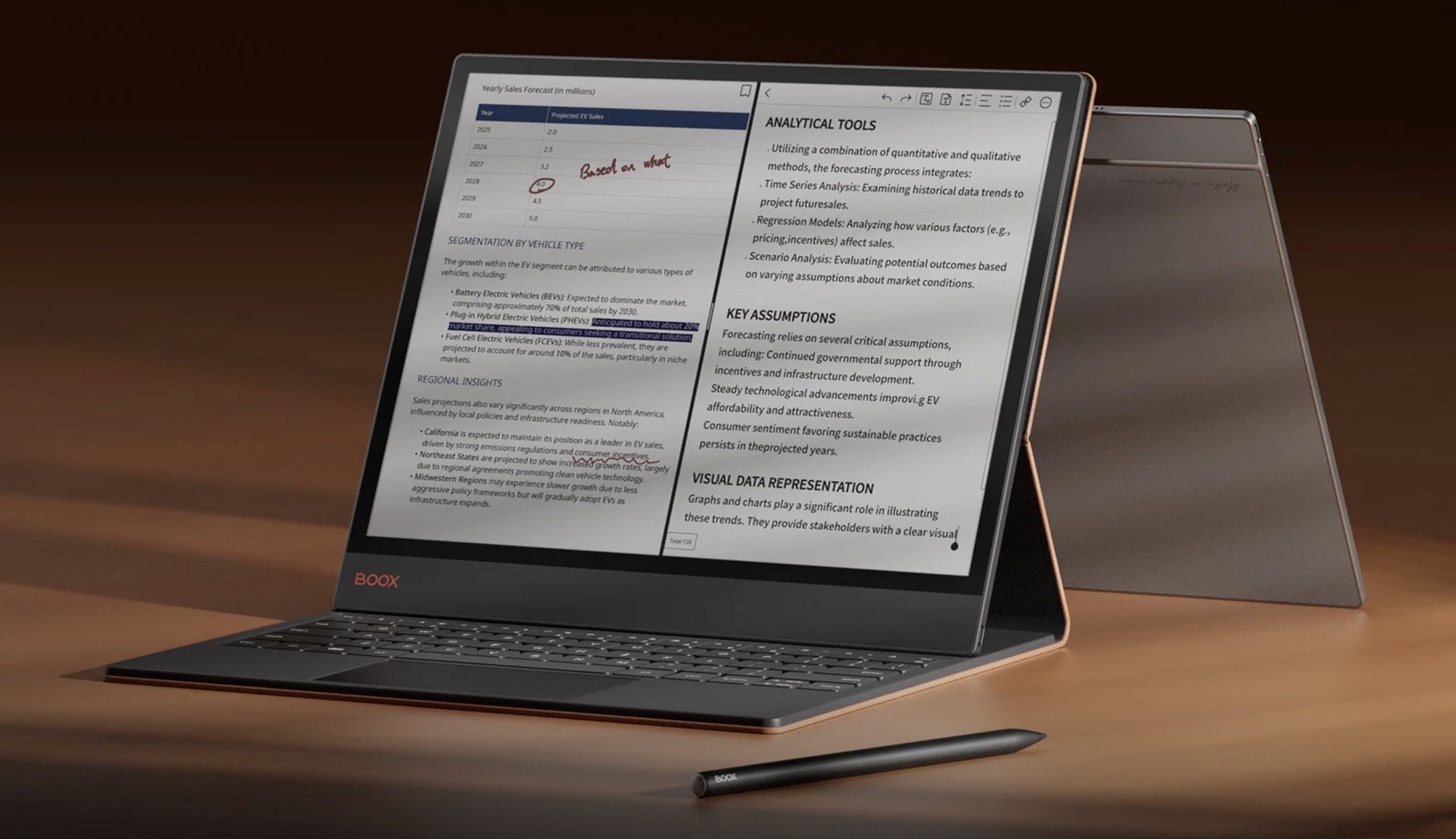
If you want an even bigger e-ink tablet, the Boox Tab X C is the way to go. It features a 13.3-inch color e-ink display that gives you all the real estate you need to become productive. You can pair it with a keyboard case and stylus to take typed or hand-written notes. It’s basically the best e-ink tablet the money can buy.
Boox
So what should you buy?
That depends entirely on what you need. If you want a no-fuss reading experience on a budget, the Kindle is hard to beat. If you want to read comics and illustrated books in color, go for the Kindle ColorSoft or the BOOX Go Color 7 II.
If you are a student or someone who takes a lot of notes, the Supernote Nomad is worth every penny. And if money is no object and you want the absolute best, the reMarkable Paper Pro and Boox Tab C is as good as it gets.
The e-ink market has grown, and it has something for everyone. There is no longer a good reason to put it off.