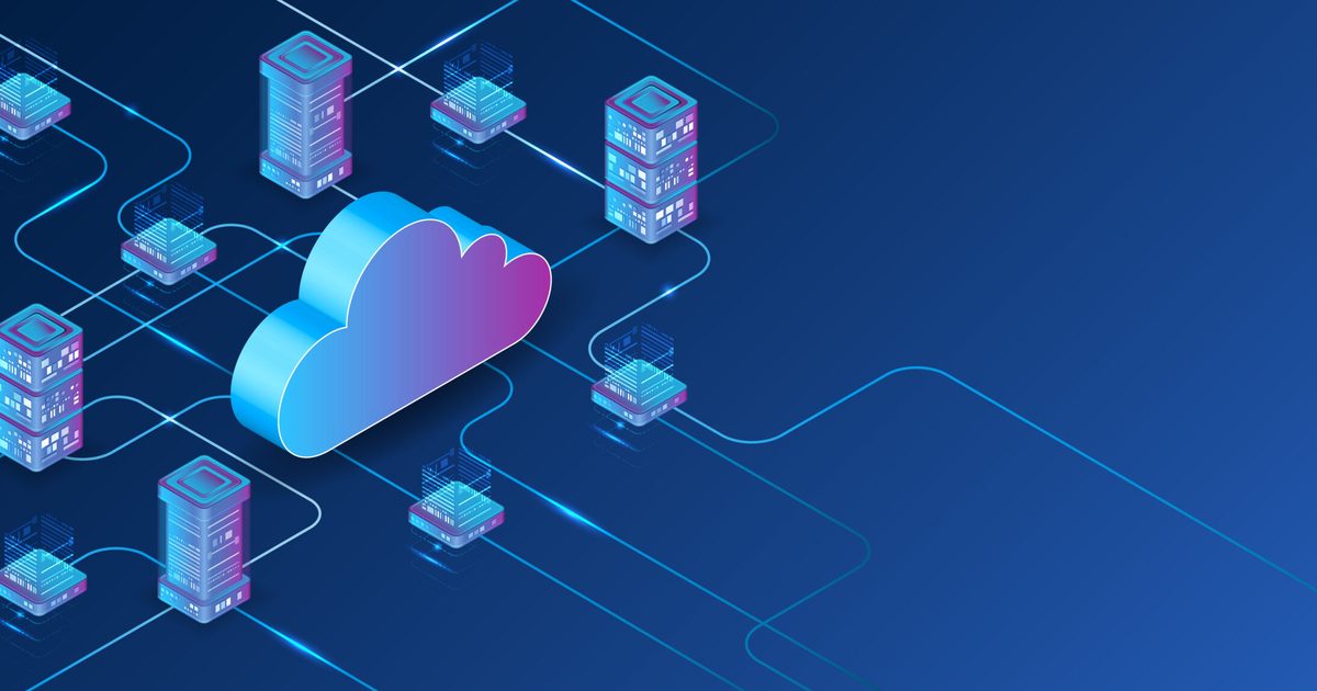
That demand also brought scalpers, who started listing the controller at inflated prices. Valve has since introduced a reservation queue to give real buyers a better shot at future stock. Still, one complaint kept coming up. For many players, the Steam Controller was simply too locked into Steam.
What was holding the Steam Controller back?
For players who mostly game through Steam, the setup works well. Steam Input handles the controller’s extra features and gives users plenty of control over how it behaves. Still, many players do not keep all their games inside Steam. For those users, the controller was harder to recommend because it did not work as smoothly across other launchers and non-Steam games.
That is now starting to change. As spotted by Phoronix, support for the new Steam Controller has been added to SDL (Simple DirectMedia Layer), the widely used cross-platform library that many games and apps rely on for controller input. It has also received a follow-up mapping update, which should help the controller behave more like a standard third-party gamepad in SDL-supported games.
How well does it work outside Steam now?
Early testing sounds promising, although it is not perfect yet. Testers in the SDL pull request said that the controller works with or without Steam running, and that touchpads, capacitive stick touch, grip sense, back buttons, gyro, accelerometer, and the QAM button are functional in some form.
That said, there are still minor touchpad issues, and running Steam in the background can cause double-input problems in some cases.
For now, it appears that the Steam Controller will have to rely on SDL to play third-party games. Valve developer Pierre-Loup has already clarified that adding standard Windows XInput support would essentially make it behave like an Xbox controller, which could limit its unique inputs, require a separate mode-switching setup, and add extra cost for users.
Apple is reportedly preparing one of the biggest Siri redesigns in years with iOS 27, but even after multiple delays, the company may still label the upgraded assistant as a beta product. According to reports from Mark Gurman of Bloomberg, internal test versions of iOS 27 already refer to the revamped Siri as a beta experience and include an option allowing users to leave the Siri beta entirely.
The move would be unusually familiar for longtime Apple users. When Apple originally introduced Siri in 2011, the assistant itself launched under a beta label before Apple quietly removed the branding in 2013. Despite that, Siri has continued to face criticism for lagging behind competitors in reliability, conversational abilities, and overall intelligence.
Apple’s AI catch-up strategy is taking longer than expected
The revamped Siri was originally expected to arrive in 2024 as part of Apple’s broader AI push. However, multiple reports now suggest the project has faced delays of nearly two years.
The issue for Apple is timing. While Apple continues refining Siri, rivals like Google Gemini, ChatGPT, and other Android-based AI systems have already rolled out advanced conversational assistants with broader real-world capabilities.
That gap has increasingly made Siri feel outdated compared to competing AI products, especially as Apple continues marketing Apple Intelligence as a major part of the iPhone experience.
Why the beta label matters
If Apple officially launches the new Siri as a beta feature in iOS 27, it could serve two purposes. First, it gives Apple flexibility to continue refining the assistant publicly after launch while lowering expectations around bugs, hallucinations, or missing features. Second, it allows the company to release AI features sooner rather than waiting for a more polished final version.
The beta branding would also reflect the broader challenge Apple currently faces in AI. Unlike competitors that prioritize rapid deployment, Apple has historically focused more heavily on stability, privacy, and controlled rollouts.
Reports also suggest Apple is introducing stronger privacy controls into Siri’s AI experience, including optional auto-delete settings for conversation history.
What happens next
Apple is expected to reveal more about Siri’s redesign and its AI roadmap during WWDC next month. Developer beta versions of iOS 27 will likely be the first public look at the new Siri experience.
However, the larger question remains whether Apple’s slower, more cautious AI rollout can still compete in a market where rivals have spent the last two years aggressively pushing generative AI into mainstream consumer products.
For now, Siri’s overhaul appears less like a finished comeback and more like Apple finally arriving at the AI race – still mid-development.
AI-generated videos are getting so realistic now that spotting a fake version of someone online is becoming harder by the week. And for creators, that opens up a pretty uncomfortable problem: what happens when your face starts appearing in videos you never made? YouTube seems to be taking that concern seriously.
The platform is now expanding its AI likeness detection system to a much larger group of creators, giving eligible users new tools to track and report videos that digitally imitate them using artificial intelligence. The feature was previously limited to a smaller pilot group within the YouTube Partner Program, but YouTube says it will begin rolling it out to all eligible creators over 18 in the coming weeks.
YouTube wants creators to catch AI clones faster
The new system lives inside YouTube Studio and is designed to help creators identify when their face may have been used in altered or synthetic videos uploaded to the platform. This means YouTube’s detection tools scan for AI-generated content that appears to replicate a creator’s likeness. If the system finds something suspicious, creators can review the content and request removal if it violates YouTube’s privacy policies.
That matters because AI-generated impersonation is becoming a growing issue online. Deepfake-style videos can now mimic facial expressions, voices, and even speaking patterns with alarming accuracy. For creators who build trust through their online identity, fake videos can quickly become damaging or misleading. YouTube says the tool is meant to give creators more visibility into how their images are used while helping audiences avoid confusion about manipulated content.
Setting it up is fairly simple — but matches may take time
Once the feature becomes available for your account, you can set it up directly through YouTube Studio on desktop. Here’s how to do it:
Open YouTubeStudio on desktop.
Go to Content Detection > Likeness > Start Now.
Give YouTube permission to use likeness detection.
Complete the one-time identity verification process.
Go to Content Detection > Likeness > Start Now.
Give YouTube permission to use likeness detection.
Complete the one-time identity verification process.
Once setup is complete, the platform will start scanning for AI-generated or altered videos that may be using your face. If any matches are detected, you’ll be able to review the content and request removal directly through YouTube Studio.
Interestingly, YouTube also warns that creators may not immediately see flagged videos after enrolling. That doesn’t necessarily mean the feature is broken — it could simply mean there aren’t many AI-generated uploads using their face in the first place.
The company says the system continues working quietly in the background even when no matches appear. This rollout also highlights a bigger shift happening across online platforms right now. AI tools are evolving faster than most moderation systems can keep up with, and companies are increasingly being pushed to build safeguards around identity misuse, synthetic media, and deepfakes before those problems spiral further. For YouTube creators, this new detection system may become one of the platform’s most important AI-era safety tools yet.
While the idea is appealing, I have never fully enjoyed using the speech-to-text feature for voice typing. I understand why it exists, and I have used it in a pinch. But it has always felt like one of those phone features that works just enough times to be useful, and not often enough to be conveniently reliable.
It’s not just about speaking clearly; the problem is a bit more subtle. You have to avoid doubling back mid-sentence, or you have to pretend your brain naturally produces clean text messages in one smooth pass. And since mine does not, I’m looking forward to Google’s new Rambler feature for Gboard. It’s a part of the Gemini Intelligence on Android, but what has my attention is how it works.
Rambler turns natural spoken thoughts into concise text. Google says that it can deal with the way people actually speak, including self-corrections, repeated words, and filler sounds like “ums,” “ahs,” and “likes.” This might sound boring until you think about how often typing is the slowest part of using a phone.
Bigger phones might finally be for me
Modern smartphones now sport near 7-inch displays that are fantastic for watching, reading, and gaming. But typing on them or using them with one hand is still annoying. And with the screen getting taller, there’s an awkward reaching game to hit the letters at the far side of a wider keyboard. Trying to reply while walking, carrying a bag, sitting in a cab, or holding coffee usually means typos, shorter replies, or waiting until both hands are free.
Voice typing should have been the obvious fix. The problem is that raw speech-to-text often gives you exactly what you said, and people don’t speak in rigid sentence structures. Real speech has pauses, restarts, half-formed thoughts, and random corrections. A voice note can carry that chaos because tone helps. A text message cannot.
Rambler’s solution is simple. Google is letting you talk how you’d normally do in a conversation or voice note. But rather than getting the exact wording and focusing on accuracy, Rambler will pick out the important parts and fit them into a message that still sounds like you.
The bilingual angle is actually huge
The great part about being bilingual is how two different languages blend during natural speech. So it was great to hear that multilingual support is available right from the get-go. Google says Rambler can switch between languages in a single message using Gemini’s multilingual model, including examples like English mixed with Hindi. A lot of people, like myself, do not text in one language alone.
We switch depending on the person, the mood, or the context. Standard voice typing can struggle when a sentence naturally moves between languages. It might get the words right, though it skips the rhythm. If Rambler can actually preserve that mixed-language flow while cleaning up the clutter, it becomes far more practical than a generic “make this sound professional” AI button.
It still has to prove it is faster than typing
I am not convinced this becomes a daily habit for everyone. A lot of people already type fast enough. Some prefer voice notes. Others may not want to talk to their phone in public, no matter how smart the transcription gets. There is also a privacy comfort test. The company claims that it will show when Rambler is enabled, and that audio is only used to transcribe in real time and is not stored or saved. Still, it has to prove that it is fast and low-effort to really stick around. But at least, Google is promising that you don’t have to think twice before speaking or make perfect sentences.
The iPhone Shortcuts app reminds me of Minecraft. It might be relatively easy to jump into, but it offers nearly limitless potential, allowing you to build anything you want. The same holds true for the Shortcuts app, and that endless possibilities are what many iPhone users might find intimidating. But you don’t have to.
If you are new to iPhone shortcuts, think of them as little automated helpers. You can build them yourself or find ones that others have built and use them. And that’s the beauty of shortcuts. If you don’t want to get your hands dirty, you can find shortcuts others have created and tailor them to your needs.
With that said, let’s check out my favorite shortcuts. These are not the best shortcuts on everyone’s list, but they are the ones I use daily to get things done faster and more efficiently.
App settings: stop digging through the settings app
Anyone who has spent more than five minutes hunting for an app’s permissions inside the Settings app knows how frustrating it can be. You have to open the Settings app, scroll all the way down, open the Apps section, scroll again to find your app, and only then can you enter its settings.
This shortcut fixes that completely. It uses the Get Current App and Open URLs actions in the Shortcuts app to detect which app you are currently in and jump straight to its settings page. Once you set it up and add it to your Control Center, all you have to do is open the app, swipe down from the top, and tap the shortcut.
It will automatically open the current app’s settings. It is genuinely one of the most practical shortcuts I have ever created, and you can download it using the link below.
Apple Frames 4: make your screenshots look professional
If you ever share screenshots on social media, a blog post, or a presentation, this shortcut is for you. Apple Frames 4 is a free shortcut by Federico Viticci of MacStories, which can wrap your screenshots in a proper device frame.
The latest version is noticeably faster, supports all recent Apple devices, and even lets you choose frame colors and scale the images proportionally. What I love most about this shortcut is that it can take multiple screenshots as input and combine them in one image.
All the images in this article have been created using the same shortcut. If you also take screenshots regularly, I can highly recommend this shortcut. I would also recommend you check out my favorite screenshot utility for Mac. It offers all the missing features of Mac’s built-in screenshot tool and then some.
Scan document: your pocket scanner is already in your hand
You don’t need a third-party app to scan documents on an iPhone. You don’t even need to open the Notes or Files app the usual way. With this shortcut, you can open the document scanner instantly and scan and save papers without any extra steps.
I have it in my Home Screen and use it whenever I need to quickly scan a receipt, a letter, or any paper document. It’s one of those shortcuts that sounds simple until you realize how much time it saves you every week.
Resize & convert: resize images without downloading a third-party app
How many times have you shared a photo only to find out it was too large, or in the wrong format for where you needed it? Since the iPhone Photos app doesn’t let you resize an image or change its format, I found a simple shortcut to do it.
The steps are pretty easy, too. You pick the image, set the size, and the shortcut handles the rest. I use this a lot when I need to send images for articles or posts that require specific dimensions.
It handles a task I would otherwise have to do on my Mac or download a third-party app on my iPhone to complete.
I deal with a lot of PDFs, and sometimes I need to extract a few pages to share or save. So I downloaded a shortcut that lets you select specific pages from a PDF and extract them into a new file.
It sounds like a small thing, but if you have ever had to send someone just two pages from a 40-page PDF, you know how handy this is. You don’t need to download any app, pay a subscription, or open your Mac. Your iPhone handles it in seconds.
Clipboard history: because you always lose what you copied
This is one of the most underrated shortcuts on this list. While macOS has finally added a clipboard history feature with the macOS Tahoe update, the iPhone still doesn’t have a clipboard history. That means every time I copy something on my iPhone, it erases all the previously copied items.
So I built a shortcut to work around it. Now, every time I copy something on my iPhone, it saves to a note, creating a running clipboard history I can refer back to whenever I need it. The only issue is that I have to run the shortcut manually for it to work.
So that’s why I have added it to the Back Tap gesture (go to Settings → Accessibility → Touch → Back Tap) on my iPhone. Once I copy something I want to save, I simply tap the back of my iPhone three times to trigger the shortcut and save the copied item in a preassigned note.
When you download the shortcut, make sure to edit it by tapping the three-dot menu and selecting the note you want to use as your clipboard history.
Turn off mobile data when iPhone connects to Wi-Fi
To balance the manual activation of the last shortcut, I give you one that is pure automation. Once you set it up, you never have to think about it again. The shortcut uses the Shortcuts automation feature to detect when your iPhone connects to a Wi-Fi network and automatically turns off your mobile data.
I have also set up the companion automation that turns mobile data back on when you leave Wi-Fi. It saves battery life and prevents your phone from uselessly using mobile data when it doesn’t need to. Since this is an automation, there’s no way to share a downloadable link, but you can learn how to create this shortcut. The screenshot should give you the basics of how to do it.
My 7 favorite iPhone shortcuts
I know the Shortcuts app can feel intimidating at first, but most of these require very little setup, and the payoff is immediately obvious. Start with one that solves a problem you have right now, and before long, you will be building your own.
If you have an iPhone and are not using Shortcuts, you are missing out on one of the most powerful tools Apple has built. So, definitely give this a try, and your life will never be the same.
Most budget headphones today look painfully similar. Same safe designs, same recycled “deep bass” marketing, and the same feature checklists. That’s exactly why Edifier’s newly launched Auro Ace immediately stands out, thanks to its animated dot-matrix display built directly into the earcups and a design that clearly prioritizes personality as much as audio.
Edifier’s Auro Ace headphones put lyrics directly on the earcups
The biggest highlight of the Auro Ace is its customizable dot-matrix display that can show synced song lyrics, animations, custom text, and pixel-style graphics directly on the headphones. Users can tweak these effects through Edifier’s companion app.
Beyond the flashy visuals, the headphones also come with fairly respectable specs for the price. The Auro Ace packs 32mm dynamic drivers, Bluetooth 6.0, dual-device connectivity, USB audio support, and AI-backed call noise reduction. Edifier claims the headphones can deliver up to 62 hours of battery life with the display disabled, while a 15-minute charge can provide roughly 11 hours of playback.
The headphones are priced at 279 yuan in China, which converts to roughly $40, firmly placing them in the affordable audio category.
I’m still trying to understand who the lyric display is actually for
I’ll be honest, the whole lyric-syncing feature feels a little baffling to me. If I’m the one listening to the song, why would I want the lyrics glowing on the outside of my headphones where literally everyone else can see them except me? It almost feels like a feature designed less for the listener and more for random strangers sitting across the metro.
Then again, that also seems to be exactly what Edifier is going for here. The company has included multiple built-in visual themes and customization options designed to match different outfits, moods, or aesthetics, treating the Auro Ace more like a wearable fashion accessory than just another pair of budget headphones.
And honestly? Maybe that’s not such a bad thing. Budget audio products have become incredibly repetitive lately, with brands endlessly recycling the same ANC and bass-heavy marketing buzzwords while the hardware itself looks nearly identical. At least the Auro Ace has some personality. Weird personality, sure, but personality nonetheless.
For many Windows users, the taskbar in Windows 11 has always felt strangely restrictive. Microsoft redesigned the interface with a cleaner, more modern look, but in the process removed several customization options people had been using for years. One of the biggest complaints? The inability to freely move the taskbar around the screen. Now, Microsoft finally seems ready to loosen things up.
The company has started testing a major overhaul of the taskbar and Start menu for Windows 11 Insiders in its Experimental channel. And honestly, this feels like Microsoft acknowledging that users want their PCs to feel personal again.
Windows 11 could soon feel far more flexible
The biggest change here is the return of a movable taskbar. Instead of being locked to the bottom of the screen, users in the test build can now shift it to the top or even place it vertically along either side of the display. That might sound like a small tweak, but for longtime Windows users, it’s a pretty significant reversal. Earlier versions of Windows allowed this kind of flexibility for years before Windows 11 simplified everything into a more rigid layout.
Microsoft is also testing different taskbar sizes, including a compact version that could be especially useful on smaller laptops and tablets where screen space matters more. Even the Start menu is becoming more adjustable. Users will reportedly be able to resize it and switch between smaller and larger layouts, depending on how they prefer to organize apps and shortcuts.
The company is finally listening
Beyond the visual changes, Microsoft is also trying to clean up parts of the Start menu that many people found cluttered or unnecessary. New controls will let users decide which sections appear inside the menu, including areas for pinned apps, recommendations, and app lists. Interestingly, Microsoft is also renaming the “Recommended” section to “Recent,” which honestly makes the feature easier to understand at a glance. The section mainly surfaces recently used files and newly installed apps anyway, so the older name often felt vague.
There are also smaller but thoughtful privacy-focused touches being added. For example, users can hide their profile photo and account name from the Start menu, which could come in handy during presentations or screen-sharing sessions. Microsoft says these changes will roll out to Insider testers over the next few weeks. More importantly, the company openly admits that the Start menu and taskbar are where users judge Windows the hardest. And after years of complaints about Windows 11’s limited customization, this update feels like Microsoft is finally taking that criticism seriously.
Microsoft’s next Elite controller has just leaked, and the design looks familiar at first glance. Though, it’s not just a typical refresh, as the next pro Xbox controller could be changing things up. In the recent Tecnoblog report, a possible Xbox Elite Controller Series 3 appeared in Brazil’s Anatel certification database.
This upcoming controller keeps the premium Xbox layout and the customization features expected from the Elite line, while even adding a couple of new controls that are not immediately obvious in function.
There’s a new Elite formula for Xbox controllers
Looking at the documentation and images shared in the report, Microsoft’s next Elite controller doesn’t appear to be a dramatic redesign over its predecessor. So the focus is to offer a more refined controller that keeps the extensive customization options still. This includes interchangeable and adjustable parts such as the D-pad, triggers, and rear paddles.
All of these are what gamers come to expect from the Elite lineup, but there are some updates with the internals to refine the experience further. The documentation points to Bluetooth and WiFi 6 support, similar to Microsoft’s compact Xbox Cloud Gaming controller. The company may likely use the same Realtek TRL8730E chipset, although the leaked documents don’t explicitly mention a chipset.
What’s actually new?
The most interesting change, however, is found near the bottom of the controller. There are two new commands between the grips, situated right next to the 3.5mm audio jack. Unfortunately, the listing does not reveal any info about their function. From the images, the new additions appear to resemble small scroll wheels.
These could be designed for flight simulators, functioning like throttle controls, or for games that need continuous adjustments. So, it is a very niche addition, but that’s also exactly the kind of thing that makes sense on an Elite controller rather than a standard Xbox Wireless Controller.
Microsoft seems to be thinking more seriously about controllers that can move between console, PC, and Xbox Cloud Gaming setups, with a new button dedicated to switching between local and cloud modes. While most of these sound like nice updates and improvements, Microsoft could be making a downgrade to the battery life. The new Elite model controller keeps a removable rechargeable battery design, but drops the capacity to just 1,528mAh, down from the 2,050mAh battery in the Elite Series 2.
As always with leaks and certification sightings, none of this is official yet. But going by the approach with the new controllers, enhanced connectivity for versatile console and cloud gaming support is a clear focus.
First-generation products usually come with an invisible warning label, which is especially true for foldable devices. They can look exciting and ambitious, but there is often a rough edge somewhere. It could be the distracting crease on the flexing screen or a hinge that feels unsure. Even the design can feel fragile while giving off a premium look.
So, it’s pretty impressive that the Motorola Razr Fold does not give off that vibe. This is Motorola’s first-ever book-style foldable, after years of building its foldable identity with its recognizable Razr series of flip phones. Naturally, you would expect some first-gen caution here. In this category, brands like Samsung, Google, and Huawei have already spent years refining their own approaches. And yet, the Razr Fold comes across as unusually settled for a debut.
The Motorola Razr Fold gets a lot of things right in the first try
The company was set on building a proper premium device from the start, and it delivered. The aluminum frame gives it a sturdy foundation, while the rear finish adds more personality than the usual glass-and-metal slab treatment. Motorola describes the Pantone Lily White version as having a silk-inspired finish with a subtle sheen. This already helps it stand out from most other foldables in the market.
The chamfered edges are another surprising win. They make the phone feel sharper and cleaner in the hand, especially when closed. Foldables can easily become chunky bricks when shut, but the Razr Fold does a good job of looking balanced and intentional.
How the hinge is the real star here
A book-style foldable lives or dies by that middle spine. If the hinge feels loose, stiff, uneven, or fragile, the confidence breaks immediately. Motorola’s Razr Fold avoids this entirely by feeling controlled and confident in hand. The opening and closing action is smooth, yet firm. It holds angles well and never gives the impression of being the first of its kind from Motorola.
Samsung’s own foldables, despite being among the most refined in the category today, took years to get to that point. Up until a couple of years ago, there were still complaints around screen and hinge issues, with the complex display-hinge mechanism becoming an expensive problem. Foldable phones are mechanically difficult, and they take time to really mature.
This is exactly where Motorola made a solid first impression. With its precision-engineered stainless steel teardrop hinge and titanium inner screen plate, the device reduces creasing while also helping make the screen more durable. The phone measures 4.6mm when unfolded and 9.9mm when folded, which is impressively slim for a device with this much going on inside.
The crease problem was not ignored
The teardrop fold design is important because it changes how the screen bends. Instead of forcing the panel into a harsher fold, the display curves into a softer shape inside the hinge area. In my own experience, I was genuinely surprised by the crease being a lot less visible than on many foldables I’ve used recently. It is not claiming to be a creaseless experience, like with the Oppo Find N6, but the attention to this detail is commendable.
The Razr Fold is still a first-generation product, and long-term durability will need time to prove itself. A few days with a foldable cannot answer every question about wear and tear. But as a first impression, this is far more polished than I expected.
Foldable phones have always had a few quirks and compromises to achieve their unique form factor. For the cool folding mechanism in a portable body, the first thing that usually takes a hit is the photography experience. Sure, you can now find some decent main cameras, like on the Galaxy Z Fold 7, but the ultra-wide and telephoto lenses are often tiny and weaker in comparison.
So when the Razr Fold was unveiled, Motorola’s first book-style folding phone itself wasn’t what caught my attention; it was the impressive camera hardware. Barring a few limited options from Chinese brands, foldables still aren’t exactly known for their camera chops. But I’ve seen these cameras before. The company recently had a stint with flagships once again, building the Motorola Signature with the best specs it had to offer. Somehow, Motorola has packed a lot of the same hardware that made it great into the Razr Fold.
After finally getting my hands on it, I wanted to put the Razr Fold through a proper outdoor test. For this real-world test, I took it to the streets of a local art district, which is basically a stress test disguised as a pretty walk in harsh summer weather.
The area is full of massive murals, bright walls, deep shadows, harsh afternoon light, tree cover, signboards, and plenty of small details hiding in each frame. If a phone camera is going to overcook colors, lose texture, crush shadows, or struggle with exposure, this is the kind of place where those problems quickly become apparent. Despite some challenging conditions, the Razr Fold did better than I expected.
The cameras love colors
Motorola has worked closely with Pantone for accurate color reproduction, and that shows in how confidently the device’s main camera handled colors. The murals in the shots are loud, with bright reds, deep blues, teal walls, yellow buildings, painted birds, and a lot more. The Razr Fold captured that energy without making the shots look silly or artificially pumped up.
In the pink mural in particular, the camera held on to the texture of the wall while keeping the sky and surrounding greenery under control. Similarly, the artwork with strong blue tones didn’t blow up the image with unnatural vibrancy either. Even against the direct sun, Motorola avoids the trap of heavy HDR processing, which can make scenes feel overbaked or artificial. The best part was the restraint, not just in colors but in the processing as well. You can see this approach in the wider street shots too.
The telephoto was another surprise for me. Foldable phones split the hardware across two halves, which makes them thinner and more complex internally. That often comes at the cost of internal space, which usually means smaller sensors, especially for the telephoto camera. But Motorola has managed a clever workaround with a thick camera bump on the back. This allowed it to fit in a 3x periscope telephoto that did a great job of punching into the frame. You get a new perspective, more detail from afar, and a better way to isolate textures and smaller elements in a scene.
Changing the experience with the foldable screen
The camera quality impressed me, but the foldable form factor made the whole shoot more fun. Previewing pictures on the big inner screen is genuinely satisfying. It is easier to check details, judge framing, spot missed focus, and decide whether a shot is worth retaking. On a regular phone, I often take a quick look and move on. On the Razr Fold, reviewing photos felt closer to checking them on a small tablet.
Motorola’s camera confidence with the Razr Fold does not feel hollow. The main camera is strong, the telephoto adds real flexibility, and the phone handled loud colors and tricky lighting better than I expected. More importantly, I had fun using it. The experience made me want to stand a while longer in the heat just to get better shots. For a foldable, that is a very good sign.